| j |
 Please report any broken links or submit additions/corrections! Please report any broken links or submit additions/corrections!
|
| The following are posts written to the Usenet Photoshop newsgroups. |
|
|
Using ALPHA CHANNELS to create the illusion of a 3D object:
1. Create what general shape you want to mess with in an alpha channel. Rename it ORIGINAL so you won't get messed up later.
2. Drag the ORIGINAL to the "new" icon (next to the trash can) and name this new channel TEXTURE.
3. Now mess around with the TEXTURE channel. Do whatever you want to it... Noise, wind, Gaussian blur, sketch effects.. whatever. Experiment so you learn the power of Alpha channels.
4. With the texture channel active, Ctrl-C on ORIGINAL. This sends marching ants around on the texture channel but in the shape of ORIGINAL. Select -> inverse -> delete.
|
. Click the Layers tab and make a new layer. Name it .. Fred.
Then fill it with something -- a color, gradient, texture, your
mother-
in-law. Then click on Filter -> Render -> Lighting effects and (this
is
the cool part!) down at the bottom where it says "texture" put in
your
TEXTURE channel!
6. If you want to trim off the excess garf, Ctrl-C on your ORIGINAL Alpha channel to load that. and then go to your layer, Select -> inverse -> delete.
--Janee
|
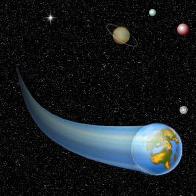
MOTION BLUR EFFECT
From looking at the image you posted the link to,
(similar
to this) there are three things going on. First there is a motion blur trail that matches the left side of the globe. Second, there is the perspective of the motion blur receding into the distance. Third, there is a curve in the motion blur that keeps the blur from being static looking. There are a number of ways to tackle this that will give you the same or very similar results as the filter. IMO, doing it by hand will give you more options to improvise along the way with the end result being something better than the filter alone could produce. To duplicate the effect you have to first create the blur trail.
1. Select the portion of the image you want to look blurred.
2. Copy this and paste it into a new layer.
3. Move the portion to be blurred to the left side of the canvas.
4. Shift click on the layer icon to select the layer.
5. hold down Shift + Option + Command (Mac) and then press the right arrow key until the selection duplicates itself off of the right side of the canvas. This produces the blur.
6. Shift click on the layer again to select it.
7. Use Edit-->Transform-->Perspective and drag the top left handle down until it meets the bottom left handle. This will produce a triangle shaped motion blur trail.
|
8. Now rotate the layer 90 degrees clockwise.
9. Use Filter-->Distort-->Sheer to create the curve. You'll have to
fiddle with this
part
to get the curve you want. The preview window will help a lot.
10. Rotate the layer 90 degrees counter-clockwise.
11. Align the blur with the object and move the blur layer below
the actual image.
Use a canvas size a lot larger than you need and crop down after you have the
image the way you want it. You may have to use the scale transform tool to
get the
blur to align cleanly with the object.
...You'll have to use the Gaussian blur filter to smooth out the blur, most likely. Also, you'll want to use a layer mask on the blur to get it to fade so it looks like the blur gets weaker as the object travels.
--c-tide |
Starfield
a) Make a layer and fill it with black.
b) Go to filters and add noise. (I usually use monochromatic and
Gaussian.)
c) Set the noise level to about 150 or so.
d) Apply the blur > Gaussian filter to this at a setting of
about 0.2 to 0.4.
e) Go to Image > Adjust Levels and move the sliders towards the
center---(move the black end slider to the right and the white end
towards the left). Adjust to suit taste and voila' a starry sky! (It only takes about 30 secs once you get it
down.)
|
To add a nebula type effect over this, do the following:
a) Add a layer above the stars and fill it with black (yikes! all of
the stars are gone!!!) Then set the layer selection to SCREEN (not
normal where it starts).
b) Change the palette colors (fore/background) to the opposite
colors you want for the nebula (like green and some funky shade of red).
c) Go to Filters > Render > Add Clouds.
d) Apply filters > Render > Difference Clouds.
--David Thomas |
Creating
Actions and using batch commands.
Step 1. Open up one of the files you want to add a url to.
Step 2. Click "window", "show actions". Look at the bottom of this palette. You'll see 6 little buttons.
The one right next to the trash can looks like a piece of paper being torn off.
This is called the "create new action" button.
Step 3. Click this button. A small window will pop up.
Step 4. In the "name" window, type something like, "add text" and click
"Record". Once you click record, you're back to the Photoshop work area.
Step 5. In the file you opened up in step 1, click the Type tool.
Step 6. Put your url in (make sure it fits in the window) text color grey
Step 7. Right-click the text layer you just created, choose "layer
effects".
Step 8. Under the "layer effects" window, un-check "drop shadow".
Step 9. In the drop down window, choose "bevel and
emboss" use the default settings. Click OK. |
Step 10. In the layer options dropdown menu (says "Normal") click down to
"overlay". (You will be able to see through the text this way - this is optional)
Step 11. Back on the "Actions" window, Click the "stop recording" button
(furthest to the left)
Voila!! You now have your own action.
Now that you have done this, let's
automate this process with multiple files.
Step 1. Ensure all the files you want to work with are in
the same folder.
Step 2. Ensure you have a
second folder for destination files. (This way you won't ruin any files if you mess up)
Step 3. Click "file", "automate", "batch".
Step 4. Ensure your batch window has your action "add text".
Step 5. Choose your starting folder.
Step 6. Choose your destination folder.
Click "OK". Let Photoshop do the rest.
--Ven Taylor
|
| Paths
Q: I'd like to ask, what are some of the uses of stroking paths?
A: If you want to draw a shape, you could draw it manually with the mouse or pen/tablet, or you could construct a path and stroke it with whatever you could have drawn with manually. There are advantages to using a path:
1. A path can be edited before you commit to the "drawing". A path has points, segments, and direction handles for curves that allow you to
alter the path in countless ways. You can change the slope of a curve, change a sharp corner to a smooth curve (or vice-versa), transform the shape (move, scale, rotate) without messing up pixels, drag a segment to change the shape without moving anchor points, etc... It's like having a liquid shape that you can mold into any other shape simply by pulling on it.
2. Drawing mathematically precise curves by hand is very difficult. The Pen tool creates them even if you have a very shaky hand.
3. A path offers repeatability. You can try out several strokes before deciding what you want to do. You can stroke it multiple times - say, a large Airbrush, then a smaller Eraser to carve out the middle of the first stroke. You can copy a path (select and Alt-drag), and make alterations to the copies before stroking them...
|
4. You can make a selection from a path, and then stroke the path with
the selection active to confine the stroke to inside the path (or outside if you Inverse the selection). This allows you to make strokes
that are soft-edged on one side, and hard-edged on the other.
Q: And how do you "stroke" it with, for example, the eraser to air brush?
A: Select the path. Select a tool and all its associated options. Click
the "Stroke path" button at the bottom of the Paths palette. You can also Alt-click the button and choose from a list of tools.
Don't confuse the Edit>Stroke menu command with "Stroke path". The Edit>Stroke command strokes a selection, not a path. The Edit>Stroke
command doesn't stroke with a painting tool, which makes it much more
limited.
You can't make good use of paths until you learn how to use the Pen tools, and that takes some practice, and frequent trips to the User
Guide. :)
Ross
(editor's note: For a tutorial on use of the pen tool, see Janee's Tutorials and look for the Heart tutorials.)
|
The
Pen Tool
Not only is the Pen Tool one of the single most useful tools in
Photoshop (I use it almost daily), but it does things which cannot be done
with any other tool or technique. For starters, suppose you want to make an image transparent. The image is
destined for print. That leaves out GIF. You plan to place the image in a
page-layout program. That leaves out Photoshop.
The only way to do this is to put a path around the area you want to make
opaque, and save the path as a "clipping path." This will make the area outside the path transparent. For placement in a page-layout program, it's
the only way to go.
The Pen tool also offers a way to make selections that cannot be made with
the Lasso, or the Marquee, or the other selection tools. For example, it is
essentially impossible to make smooth curves with the Lasso tool. Using the
Lasso to select regular, smooth shapes--the outline of a car, for instance--is tedius and results in an inferior selection, because the Lasso
tool doesn't make smooth, even curves. (And depending on how much difference
there is between the car and the background, the Magnetic Lasso tool might be
useless as well.)
The Pen tool allows you to make selections you can go back and adjust later.
You say you can do that with the other tools, by adding to or subtracting
from the selection? Not always; try doing that and keeping smooth curves!
|
And Pen paths can be scaled, rotated, and flipped evenly and uniformly, with
no loss. You say you can do that by expanding, contracting, or transforming a
selection? Try it. Make a sharp-edged selection, then expand it a few times,
maybe rotate it...It isn't smooth and sharp-edged any more! That's because
all selections are actually channels; they are broken up into pixels. A path
is a mathematically perfect entity. It is not made of pixels. It can be
scaled, rotated, skewed, flipped all day long, with zero loss and zero
degradation. It will always be hard-edged and perfect no matter how it is
transformed.
The Pen tool is the single most difficult to learn tool on the Photoshop
toolbar. You must learn a completely different system for creating shapes;
you must learn that there are three distinct types of Pen points, and how to
use them, and when each type of point is appropriate. You must learn the
basics of how a Bezier path is created--for example, a circle is always made
of four points, no more and no fewer, no matter how big the circle is.
But there are types of selections which are difficult or impossible to make
with any other tool. Learn to use the Pen tool, and you will wonder how you
ever used Photoshop without it. |
What kind of computer
should I get?
Q: Ok, I have a
question concerning Photoshop, and other programs like Illustrator, Quarkxpress,
and Corel Draw. I have used Photoshop and illustrator on the Mac in high school
and is was great! So now I am planning on going back to school to study Graphic
design. They teach you all the usual programs on a Mac. HOWEVER I want to learn
the applications on other computers (with windows) so my knowledge of design
will be on both formats. There is one problem, I don't know the first thing when
it comes to how many MHZ, MB, or what processor I will NEED. (not the best,
cause I doubt I can afford that.) Can someone tell me what numbers are good to
use with these programs? Thanks. Any and all help will be very much appreciated.
A: If you are having some doubts on what you can afford, you do have to consider computer graphics is a "bleeding edge" business. You do need to stay up on the hardware and software issues. As per which ever platform you need to go with, it really depends on what your end product is intended to be. If you plan on doing print based publishing, then you should be on a Mac since most service bureaus and print houses use Macs. You'll also need apps like Quark Xpress, Illustrator or Freehand as well as Adobe Photoshop. It is generally better to use a Mac in print publishing since you won't have any extra headaches with color shifts and type problems when your file travels across platforms.
If you plan to do web design, you're better off with a PC --for the same reasons of color shifting between platforms. Windows has a better color handling than the Mac. The overwhelming majority of web users use PCs. Many ad agencies, while still dominated with Mac, defer to PCs very often for web design primarily for that one reason. In addition to the color issues, the leading web design programs such as Fireworks, GoLive and FrontPage are better supported and implemented on the Windows platform.
|
For 3D animation
stuff, if you can manage it go with a UNIX system such as a Sun workstation
outfitted with Lightwave 3D or an SGI IRIX configured with Alias
Power Animator or Maya. For a more affordable, yet still professional setup,
you can run a WinNT system with Kinetix Studio 3D Max or Lightwave 3D.
The Mac platform currently isn't greatly supported by professional 3D apps.
Electric Image and Lightwave are the two heavy hitters for that platform,
but with Mac OS X coming and a Mac version of Maya on the way, that
will even things up a good bit.
As far as platforms go, though, I frankly have to say, "who gives a s***?" The apps are the key thing. Adobe Photoshop works very much the same on a PC or a Mac. Same for Illustrator, Freehand, QuarkXpress and many other applications like that. It certainly wasn't like this years ago. And platforms may shift again with things like Linux getting more popular and the uncertainty about what the DOJ may do to Microsoft. Just learn the applications. If you can find your way around on a computer reasonably well at all, it isn't such a big deal jumping from one platform to another.
--Bobby Henderson
|
FIXING IMAGES FOR THE WEB
SLICING IMAGES
If all you need is horizontal slices, you can just take advantage of the
SELECT and INVERSE-select ability.
Step 1.
Use the marquee tool to highlight the top part of your original
image, say the first couple inches or whatever.
Step 2. Now COPY this highlighted section by pressing apple or control-c and
then open a NEW blank image. Remember Photoshop anticipates that you want
your new image to be the exact dimensions of your COPIED section, so this is
really easy. PASTE it (apple or control-V) into the perfect sized new blank
image and you've now got your first slice. Save this as slice1.
|
Step 3. Return to your original image, but don't touch anything! Your
original image should still be - and must be - actively crawling with the
marquee's selection still highlighted. This is vital. Now, from the menu, do
SELECT > INVERSE. Now IMAGE > CROP. You now have slice 2! Repeat steps as needed for as many slices as you want.
--Will Bueche
|
More on Image-Slicing
Use your rulers and guides to divide your image using pixel measurements,
after you do that use the rectangular marquee tool to select first portion
of image, make new image in same measurements as slice and save as Jpeg. Do
the same with all your slices,
|
save them all as separate images, then when
in your html editor create a table for them using nil cell padding and nil
borders then just paste in your separate images and voila.
Sounds hard, but it isn't really when you get the knack of it.
--Jase!! |
Animating Gifs in Image Ready
If you have 5.5 or above, you also have ImageReady.
You can create your frames in Photoshop, each layer being a frame. If you have a background you need for the
whole animation you can create
that on its own layer and when your foreground movement frames are done, duplicate and merge the background with each one so it is the
same on each one.
|
No need to save out as separate gifs. When you have your frames the
way you want them, Save and jump to ImageReady. You can save each layer as a frame in the animation palette and further determine the
timing, tweening or whatever. When you are satisfied with the animation you can save optimized as a gif.
--edjh |
On color correction
Q: I am trying to color correct some slides after scanning, and I am
having trouble trying to correct one color without affecting the others.
For example, I have an image of a horse. I want to keep the horse very black, get
the green a bit punchier, and make the blue look stronger.
The original slide has that, and I am trying to make "contact sheets" so that people can order prints from the slides. The scans are coming out too pale in the scale and just not very punchy.
When I fix the sky, I end up with a blue tint to the horse and the green is lost. I figured I need to be working with the color channels, but when I try to view a channel
separately, it is black and white. Only after I hit
okay, do I get to see the changes. Is this the way it is normally done, or am I missing something?
Is there a way to affect only the blues (or reds, or greens?) And can I view the channels in color?
A: To answer your other question, yes, you can view the channels in color by
changing a setting in "File > Preferences > Display and Cursors". To see what's
happening to your final image, use "Window > New View" and you will see the
complete color image in a separate window.
|
Here are some other things that will probably save you some time:
To add punch to the contrast, use the "Image >Adjust > Auto Levels" menu item.
If this causes too much of a color shift, or is too extreme, go to
"Filter > Fade Auto Levels", set the mode to Luminosity, and back off on
the slider until it looks OK.
If you want to add punch to the colors, use Image > Adjust >
Hue/Saturation. Do this via a Correction Layer and you will be able to recover your original
data.
For control over individual channels, it is more efficient to use a Curves
Correction Layer and use the popup to select each color channel and adjust
it. With preview checked you will be able to see your colors as you make
your changes.
Use Unsharp Mask to add sharpness to your image - be careful not to overdo
it to the point where everything gets white borders and takes on a metallic
sheen.
There is a lot to color correction - if you want to know more get any book
by Dan Margulis.
-- Mike Russell
--
http://www.zocalo.net/~mgr
|
Making Icons
Q: Does anyone know if it's possible to create/edit icons using
Photoshop?
A: Yes, it is possible.
Create a square document - you can do this with a transparent background if you
wish.
|
When you are ready to save your icon, first resize it to 50x50 pixels.
Next change the mode to indexed color, saving transparency if you wish when you
do so.
Save a Copy as filename.bmp. In the Windows Explorer, find your bmp file and
rename the file tag to "ico".
Voila. |
On Mouseover Scripts
Here's some Javascript for mouse rollover code that is a little more simple.
Overview.gif shows when NO mouseover, overview1.gif shows WITH mouseover.
You'd have to have one of these functions (onoverview) for each set of mouseovers that you want. More complicated javascript sets up an array,
that as a package can handle as many mouseovers as you want without having
one script for each. Overview.gif and overview1.gif reside in the graphics
directory immediately below the location of the html file that contains this code.
|
<SCRIPT LANGUAGE="javascript">
function onoverview()
{
document.overview.
src="graphics/overview.gif"
}
function offoverview()
{
document.overview.
src="graphics/overview1.gif"
}
</script>
The above javascript sets up the function (the formula for operation).
The line below (best all on one line) which would be below the Javascript
above calls the function (onoverview) and sets up the html for operation.
<a href="overview.html" onMouseOver="onoverview()", onMouseOut="offoverview()"
target="mainFrame"><img src="graphics/overview1.gif"
name="overview" border=0
width="125" height="25"
alt="Overview"></a>
--Dave Moore |
| Making a © brush
For a detailed tutorial of this click HERE.
Hold alt and type in 0169 from the keypad to the right.
That will give you the © sign.
Now here is another idea. Make yourself a © brush with your copyright notice! Make a new file
and then do your copyright notice in black.
|
Size it about the way you would want it to appear on the biggest thing that you are likely to frequently do. Select -> all and then click the arrow to the right on your brushes palette. Choose define brushes. It will put your copyright
notice into a brush for you! Now go and copyright your version of the world!
--Janee |
Layer
Effects
Q: I'm still having problems with Effects. Or maybe not. Most
of the time, I see *no* difference at all, trying every variation of color,
angle, blur, intensity, opacity, etc. I also tried variations with the
selection marquee, the lasso, the magic wand, etc. thinking the area had
to be highlighted in some way.
A: The layer Effects work on a layer. No selection you have made makes any
difference. The Layer Effects do not work on selections; they affect a layer--AT ITS EDGES.
Say you have a picture of a room on a layer. There is a TV set in the room. You
want to emboss the TV set. You do not select the TV set and use the Layer Effects commands. This will do
nothing. Instead, you must put that TV set--just the TV set--ON ITS OWN LAYER.
Q: It's possible I'm doing everything correctly, but I'm expecting too much from the effects.
But you would think there'd be *some* visible difference when, say, the Embossed
effect is on very deep (depth) or whatever. Maybe I need a special layer (duplicate layer, plain layer), although I've tried those variables
too.
|
A: The layer effects are quite dramatic. If you don't see a dramatic difference,
you are not using them right.
You do not need a "special" layer, but the thing you are trying to add the
effect to must be on its own layer.
Q: Another question: I noticed copy/paste effects, but that doesn't seem
to have any effect (can you explain the function of that?). A: Simple:
Say you have 60 layers. You want to put the same exact layer effect on all of them.
You do not need to go through the Layer Effects dialog sixty times. Instead,
you do it once, use the Copy Effects command, then switch to each layer and use
the Paste Effects command.
Copy Effects copies all the layer effects from one layer. Paste Effects pastes
the same effect with the same settings onto another layer.
--TacitR
|
More
on Layers and Layer Effects
by TacitR
Q: I also
tried feathering, without effect, although it visibly affected my lasso.
A: Feathering has no effect on a layer effect. Layer effects work
on entire layers, not on selections. Let's suppose, for example, that I have several words of type, each on its own
layer. (Why? Maybe I want to position all the words individually with respect
to each other.) I can copy/paste the layer effect--a glow, for example--and
it'll be identical on all the layers.
Same deal goes for, say, an emboss effect. I recently did a game board for a
video board game, by starting with a uniform canvas and selecting portions of
the canvas. Each selected portion of the canvas was placed on its own layer,
and a Pillow Emboss effect was applied. This had the effect of creating a
number of "squares" on the board, each of which looked as if it had been
engraved into the board. Each of these layers, naturally, needed an identical
layer effect.
The easiest way to do this is to make a selection, then hit Command/Control-J.
This takes what you have selected and jumps it onto a layer--no copy-paste
required.
|
The advantage of using layer effects is that you can change, or undo, the
effect later. If you create a halo by stroking a selection, you will not be
able to change that halo next week if you decide you don't like it. With a
layer effect, you can always come back to the Photoshop file later and change
it.
Q: As for the type, I find it difficult to understand this. Are you saying
that, say, on one layer you have the word "Help," then, on another layer, not overlapping "help" you
have "me" then on another layer you have "out"? And, even though these words are differently placed,
a single effects command will glowlight all the words together?
A: I place all three words on three layers. I use the Layer Effects command to put
a glow on one of them--say, the word Help. When it looks exactly right, I Copy
Effects.
Then I switch to the Me layer and paste effects. Then I switch to the Out layer
and Paste Effects. Now all three words have the same exact layer effect on
them.
--TacitR
|
| Adjustment
Layers, Care and
Feeding of
An adjustment layer basically lets you do adjustments to an image without actually changing the value of any pixels. It also allows you to go back and change the adjustment settings. For example, if you wanted to run levels on a layer, you would normally go to Image>Adjust>Levels, change the settings and OK. If you didn't like these settings, you would have to Undo, then go back to levels and do it again. By using an adjustment layer, you can make a levels adjustment layer Layer>New>Adjustment Layer, Type Levels, then apply the settings.
If you ever want to change the settings at any time, you can go back and change them by clicking the half-filled circle on the layer. Also, if you click on the thumbnail for this layer, you can draw/apply a mask that will mask the effect of these settings. Finally, the adjustment settings will affect all layers underneath that layer, so you can apply the same effect to multiple layers.
--Dilbert
|
Excellent
explanation. Not much to add other than the real power of
adjustment layers come in. They save a LOT of memory space. If you
want to
make changes or just to test something you'd normally create a copy
of that
layer (because pre version 5 no history) and test it out. Adjustment
layers
take up very little space and are more versatile.
--Serena
Another nice thing about adjustment layers is that you can go back and change them after saving your image.
- JohnBoy
Q: You mean, if you flatten the image, the adjustment layer is still there?
A: No, not if you flatten, but any other way you can still change. For example, if you apply levels to a layer, then apply several filters, there is no way to undo the levels without also undoing the filters. With an adjustment layer, you can apply levels, then at any point in working with the file (as long as the adjustment layer is still there) you can change the levels settings back, or change them to something different.
--Dilbert
|
|
j |
 Photoshop Tips from the Newsgroups


