|
Ask the Goddess Archives 2003
|
|
|
|
|
|
|

For quicker answers to your PS questions, ask in the Message Board!
|
From the myJanee.community:
I just can't get to grips with the pen tool! How is the best way to get to grips with it?
--a newbee
Hey there, Blue!
Don't feel bad about that. The pentool is a bugaboo for lots of people. I remember being really frustrated in the beginning, because all i could make it do were jaggedy lines, instead of gentle curves. Then i locked myself in my office one day and researched the danged thing, trying stuff and working on it, till i finally got it. That's when i wrote the Heart tutorials.
My advice for getting onto the pen is to get a photo of different objects and then use your pen to make a path out of each one. My heart tutorial would also be a good place to start. :;):
I primarily use the regular pen, instead of the freeform pen, because, for me at least, i can't draw a smooth enough curve free-hand, and it ends up with too many anchor points, thus that jagginess! When you are using the Pen, you will also need a couple of other tools that come with it, the Convert Point tool, and the Direct Selection tool. You may also need to add or subtract points, but those are not as critical at this stage.
With the regular pen, you can approach it a couple of different ways, either the fancy way that you see the hotshots use, or the brute force way. I like brute force. I begin by first putting down the anchor points, just by clicking around the shape i want, only at the points where the path is going to change direction or it just needs an anchor.
Then I make the curves. To do this, you have to make your anchor points from corner points into nodes on the curve. You change the point from a corner point to a node, by dragging the point with the little < tool, the Convert Point tool, under the pen. Whenever you are using that, it will be changing your point back and forth between a corner and a node.
When you drag the point with the Convert Point tool, it will make handles with which you can shape your curve.
Now.. to just shape the curve, if you want to keep it smooth, you use the Direct Selection arrow, the white arrow.
You can also move points around, using the Direct Selection arrow. To get the Direct Selection arrow, hold the Ctrl key whilst you are working within the pentools. So the main tools you will use will be Convert Point, just once on each of the points that will be curve nodes, and the Direct Selection arrow which you use for moving points and adjusting the handles.
I AM going to eventually have a nice lesson on the use of the Pentools, because it is just critical for drawing or making smooth selections... lots of things.
Always me, Janee
From: Michael B
Sent: Saturday, April 12, 2003 11:32 AM
To: janee@myjanee.com
Subject: Ask the Goddess
Dear Janee:
I need to replace missing teeth in a photo of a young girl using photoshop 7. She also has two teeth that are not straight. How do I do this with photo shop? I really need your help on this. I am a Photographer with my own studio.
Respectfully Yours
Michael B
Photographer
Hi there, Michael!
This is funny. I don't think that I've ever had this question before, and then I got the same question 2 days in a row!
First, be very sure that the client really wants to have this done. I'd point out that, by doing this, you are actually altering a historical record, what the girl looked like at that age. I would want to keep it as is, if it were me.
 If you still want to do this ;), I would try first cloning them in, using the teeth that are already there. Clone onto a separate layer, in case it doesn't go perfectly. If you still want to do this ;), I would try first cloning them in, using the teeth that are already there. Clone onto a separate layer, in case it doesn't go perfectly.
Then, if that goes badly or you need a touchup, I would paint in the teeth or any corrections. Choose a 1-pixel hard brush and sample-paint from the teeth that are there. To do this, hold Alt and this turns your paintbrush into the eyedropper temporarily. Click on a color from the teeth, paint, alt-click, paint, and so on.
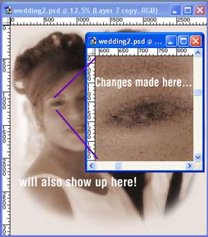
Tip: zoom in tightly to do this. It is handy to make a micro-view window for this zoom work, keeping the normal view open as well, so that you can see the "big picture" as you work. To make a micro-view window, Window > Documents > New Window. Then you can zoom way in on this micro-view window. Any changes you make on this one will show on the big image as well. Very cool.
This would make a great tutorial for my site, actually, if I can find a suitable photo to work with. <hint> Do you have any that I could use, with full permission?
Hope this is helpful to you, Michael. Let me know how it goes!
Always me, Janee
From: Steph
Sent: Wednesday, April 09, 2003 10:53 AM
To: Janee
Subject: RE: myJanee's tutorials
Janee -
I would classify myself as a beg/intermed. Photoshop user. I am really really good with the features I do know but there are so many more that I know nothing about. I would really like to gain more knowledge and I have plenty of opportunity here to practice. (I do some graphics work). A couple of topics I would like to learn:
Channels (have no idea what it even is or does)
Layer Masks (I used your torn paper tutorial and it came out beautiful - I used the layer mask but I still don't know what it does really)
Load Selection - I don't understand the concept of loading a selection at all
Any help you could provide would be greatly appreciated.
Peace and good stuff,
Steph
Hi there, Steph!
You are not alone in wanting to know more about these seemingly mysterious and esoteric things like channels and masks. I remember when I first started learning Photoshop and I was scared to do anything with masks or adjustment layers. They just sounded spooky and so I stayed clear of them.
Adjustment Layers. Eventually, though, I gained my courage and discovered a whole new world. What these babies do for me is that they make my photo editing and artwork much more flexible. I can do a color Adjustment Layer, for example, and then, by painting black on the mask that comes with the adjustment layer, I can shield parts of the image from the adjustment. Very useful if you have a picture that is really faded on just the top half, one person that came out too light, or a pic that has a big stripe that is tooo blue... something like that.
Layer masks are very cool too. When you work with a layer mask, you have two layers. The top layer is the one that you put the mask on. The places where you paint black on the mask that layer will be hidden, allowing what's underneath to show. With a Layer Mask, then, you can paint a black > white gradient on the mask, for example, and the top picture will seem to fade seamlessly into the bottom picture.
You may be thinking, as I did, "well why do I need a layer mask when I've got my trusty eraser? You can do a kind of fade erasing to get the same effect." Well.. first off, that's harder to get really even. And secondly, with a Layer Mask, you can always go back later and fiddle with the masking. Once you have erased, well... it's GONE!
Alpha Channels are Photoshop's way of holding onto a selection for you. These are very handy for lots of times when you ... want to have a particular selection to be held! They do not increase your filesize, either, interestingly.
Those Red Green Blue channels are kinda cool. Those are actually like masks that let that color of light get through. Do this to get an idea of what's going on here:
- File > New.
- Now fill the canvas with red.
- Click the Channels tab and have a look.
- Predict what the RGB channels will look like if you have filled the canvas with pure blue.
- Check it.
- Now ... what will it look like if you make a wide RED swath across the blue?
- Try to answer this before you try it.
- What about filling the canvas with yellow? Black?
- Why are all of the RGB channels white if the canvas is filled with white?
Loading a selection: This would be handy if you had a lone shape on one layer but wanted to cut that shape out of another layer. Ctrl-click the shape layer. That makes the marching ants go around the filled pixels on the layer. Then click the other layer and hit Delete. Those same pixels will be gone from your other layer.
I have some nice discussions I have culled from the newsgroups re many many topics. This should be interesting to you. You can find the index of topics here: http://www.myjanee.com/PSRL/PStips.htm.
For more on layers and selections and just getting comfy with them, have a go at http://www.myjanee.com/tuts/pctext/pctext.htm.
And finally, a good exercise in Alpha Channels is at http://www.myjanee.com/tuts/jewel/jewel.htm.
Hope this helps!
Always me, Janee
From: thorus
Sent: Sunday, April 06, 2003 3:15 AM
To: janee@myjanee.com
Subject: Fader
Hi!
I am new to Photoshop and I wonder if I can make a fade image from color to black & white .
The image I created is a rendered one from Bryce and I like to know the way (sure is posible in Photoshop) but i haven't figured how to do it. In the same image the transition must be from colour to black & white.
If you have time, please can you help me?
Many thanks in advance,
Marius
Hi there, Marius!
It is possible to do what you want to do, to be sure. Here’s how:
- Open the image that is in color in Photoshop.
- Image > Duplicate Image.
- Use your favorite method to take the color out of this duplicate.
- With the move tool, drag your images onto the same canvas. They should be on separate layers.
- Now click on the topmost of these layers in the Layers Palette.
- Click the Create a Layer Mask icon (the little white circle) at the bottom of the Layers palette.
- Now… see the little white square next to that layer in the Layers palette? That is the Layer Mask. Anything you paint black whilst that Layer Mask is selected, will disappear from the top layer. Go on, grab a paintbrush, and try it. I’ll wait….
- …..
- Now that you are done playing, Ctrl-backspace to fill the mask with white again.
- You want an even fade from the colored image to the black and white one. This means that you want the color to gradually fade away, permitting the b/w image to show through. (Or, if your b/w layer is on top, you want the b/w to gradually fade away, letting the color show through. Same result.)
- Choose the Gradient tool and choose Linear Gradient in the options. Be sure that the foreground to background black > white is chosen.
- Now drag a gradient from one side of your image to the other. Hold Shift if you want it straight on the canvas.
- If you need to touch it up, like make part of it show more color, you can take a large soft brush and either black or white and touch up the mask.
Let me know how it goes!
Always me, Janee
 Question in the myJanee.community: Question in the myJanee.community:
How do I use the Healing Brush when I am working in a dark area that is next to a light area?
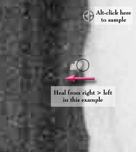
Healing does not always come without "infection." If you are healing a black area that is up against a white area and you get too close to the white, the white will seem to spray into the blackness. You can fix that in one of 3 ways. (There are always 3 ways to do anything in PS!)
- Before you start healing that area, make a selection around the part, making sure not to include the dark/light transition area.
- Give up on healing and use the Clone tool.
- Use the exact transition of black > white as is near your source and then start with that same spot adjacent to where you are fixing and move down to the spot that needs fixing. This is probably the most realistic and clean way of doing this. The Healing Brush Tool is a really great addition to PS 7, and it can greatly improve your life, if you do much photo retouching or restoring.
It has happened yet again! I got an email with a good, rather urgent, question. I wrote an answer and sent it... and then i got it back. Bad address! Here is the letter. Maybe the person will see it.  And maybe someone will read this and be a bit more careful when they are sending an email, to make sure that the return addy is working. --Janee And maybe someone will read this and be a bit more careful when they are sending an email, to make sure that the return addy is working. --Janee
From: Media
Sent: Wednesday, March 26, 2003 1:42 PM
To: janee@myjanee.com
Subject: layers are missing....
Hi
Wondered if you could help? I have Photoshop 7 but after my brother has used it, the layers box seems to have disappeared and all I have are the channel options. Is there any way of bringing them back? I have had a mess around but to no avail.
Grateful for any suggestions. Regards,
--Fifi Powers
Yikes!  Well, let’s fix that! Go to Window > Show Layers. That should bring it back for you. Well, let’s fix that! Go to Window > Show Layers. That should bring it back for you.
Another possiblity is that he has docked the palette into the palette well at the top. You have to have your screen resolution set kinda small to see the palette well. If he was messing with resolutions, then that may be it, too. Let me know if you can’t find it still.
Always me, Janee
From: Robert K
Sent: Thursday, March 20, 2003 11:00 PM
To: janee@myjanee.com
Subject: Night Vision effect
Been to your site many times, you seem to know photoshop pretty well. I'm good with the app, but there is one special effect I am trying to achieve, and can't find a good tutorial on it: Night Vision. Do you know how this effect is done? I have a way of doing it, but I don't know if there might be a BETTER way. Help?
--Rob
Hi there, Robert!
I have spent a couple of hours researching this for you and have come up with a way. I'm curious, too, to know YOUR way. Maybe I can write a tutorial that marries the two ways, to the benefit of all of the night vision afficionadoes out there.
|
So here we go:
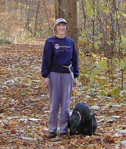
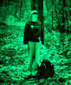
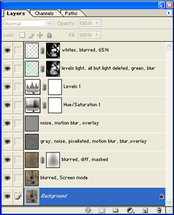
Night Vision Effect: This is an effect that uses several layers, each manipulated differently, and blended in with a blending mode. There are also 2 noise layers blended in, and two Adjustment layers. Build it from the bottom up, with the bottom layer being the image you want to view through the night-vision goggles. I began with this photo:
|
 |
|
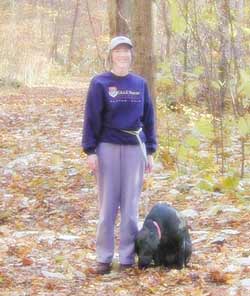
Duplicate this bottom image layer twice, so that you have three copies of it. Turn off the eye for the topmost of these.
For the second layer, Filter > Blur > Gaussian Blur. Make it pretty blurred. You should not be able to discern ANY detail, but you should be able to kinda tell what the picture is... kinda.
Now put this layer into Screen blending mode. This lends a really hazy furry look to the picture.
|
|
|
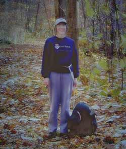
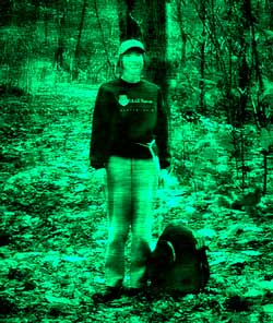
Turn on the visibility eye for the third layer (top one). Filter > Blur > Gaussian blur.. a LOT, even more than before. This time, put it into Difference mode. This should make the picture very dark.
Add a Layer Mask to this third layer by clicking the Add Layer Mask button at the bottom of the Layers palette, and, using a very large soft brush, paint on the canvas anywhere that you want to not be as dark.
|
|
|
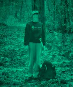
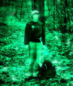
Now time for some color. Add a Hue Saturation adjustment layer at the top of the stack, by clicking the Create a New Adj Layer button at the bottom of that Layers palette. Click Colorize and then choose hue, sat, and lightness that suit you. I used hue of 167, sat of 100 and lightness of -41.
|
|
|
We are going to be lightening up and exaggerating the contrast next. Make a Levels Adjustment layer and bring your lightness and darkness sliders toward the middle till you lose some detail in the darks and lights.
|
|
|
We need to noise this up a little. Click the third layer, the very blurred difference layer. Now click Create a new Layer. Fill this with 50% gray. Filter > Noise > Add noise. Not a whole lot.
Now.. so that you can see what you are actually doing with this noise layer, put this layer into Overlay mode. I like some motion blur to the noise, angle of 0°.
I added another noise layer, too, which I filled with gray, noise, same as before.. but then I used a pixellating filter and then another motion blur. This gave a little more of a chunky sort of cloudiness. Use Overlay blending mode here, too.
|
|
|
You still will need to bring out the lights more. For the over-exaggerated lightness, here's what I did. I used two layers, one of green highlights, and another of white highlights:
To "find" these highlights, I duped that bottom layer again and then used Image > Adjustments > Levels. Adjust the levels till you have white patches. Now use the magic wand, contiguous OFF, to select the white areas. Ctrl-Alt-Shift-I to inverse the selection, and Delete.
Give this a bit of Filter > blur > Gaussian blur. Add a layer mask to this layer and paint on it with a black soft brush, to get rid of any overwhitening. You can also reduce the opacity of this layer. I did, to 65%.
Now dupe this layer, Ctrl-click it in the Layers palette to load it as a selection, and fill this with a bright cyan-green. Give this layer a blur too.
Move the white highlights layer to the top of the stack.
|
|
|
Tweak any of the adjustment layers, opacities, or blending modes as you need.
Fun stuff. Thanks for giving me this inspiration!
Now tell me your way.
This ended up being pretty fun!
Always me, Janee
|
|
|
|
From USENET newsgroup:
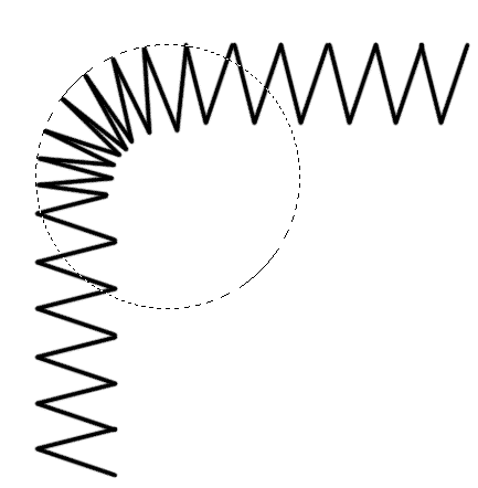
Can this be done? Take a donut (one with a hole in the middle), and 'thin' out the donut but keep the outer diameter constant while increasing the inner diammeter, but all without cropping the image in the donut area, but rather compressing (squishing) it into the smaller area.
Remember this is a circular object.
Thanks in advance
Guy
Hey there, Guy!
Ok, i have a fix for you which may work.
1. Center the donut exactly on the layer.
2. Filter > Distort > Polar Coordinates. Make it Polar to Rectangular.
3. Now Ctrl-T to bring up the Transform handles. Hold Alt and drag the top side down.
4. Now undo the Polar Coordinates: Alt-Ctrl-F to bring back your last filter (polar coords) with its dialog box. Change it to Rectangular to Polar.
5. You may have to do some normal Free Transform to get it as you want it, but.. it should be close!
Always me, Janee
|
|
|
From: Bic
Sent: Friday, March 07, 2003 4:47 AM
To: janee@myjanee.com
Subject: contact Janee
Hello Janee,
I was studying various photoshop techniques on a site tonight [www.metamorephosis.com], and I was eventually linked to your site, a result of my sheer curiosity. WOW! Your site is really helpful and rather interesting. I have learnt a LOT in just an hour that I have been on it. Even made a few prints of your techniques, so I can practice.
I am not an 'expert' photoshop user, just a little less than intermediate, one may say.
I am writing to you coz I NEED HELP URGENTLY on a technique for text.
I am designing a children's book cover, and the name of the story that goes on the cover is a very interesting font. My question is, I would like to manipulate/distort a few letters, e.g. the down stroke of the letter 'R', etc., and I was wondering how to so this in photoshop. I have heard some techniques about converting the text into a 'path' and then playing with the handles, but I have NEVER explored the Paths tool, so I have no idea how to do this...if this is the right way that is. I believe once you make paths, it becomes a crisp vector based text....is this relevant in my problem question? Or am I going off point here?
I am in a deadline stress situation, and it has to be completed in the next 2 days. Please HELP ASAP. I am counting on you.
Thanks,
Perplexed...totally,
Bic Luther
Hi there, Bic!
Well, let’s see if we can unperplex you a bit! Photoshop’s type is vector-based. That is why, if you want to run it through a filter, you have to “rasterize” it first. That’s the process whereby PS makes it into pixels. After it is pixels, you can’t edit it anymore as text.
Once you make the text into a path, you also won’t be able to edit it as text, but you will be able to manipulate the path and fill it with whatever, onto a regular (not type) layer. Another thing to watch for is this: You can’t create a path from a layer of type that is done in a “faux bold” style. Ok.. let’s proceed:
- Type out your text in about the size you want, and using the font that is closest to what you ultimately want.
- Click Layer > Type > Create Work Path.
(If it says that you are working in a Faux Bold style, you have to change that. PS has very cleverly HIDDEN this setting, too. In the Type options bar, far right, you have to click that little icon to bring up the Character palette, unless you have it up already. On that palette, top right, click the little fly-out arrow. Uncheck Faux Bold. Then you can proceed.)
- Now to manipulate (nip) the path, you have to be a bit facile with the pen tool. I like to do this sort of nipping by first eliminating extraneous anchor points. It seems that the fontmakers always put in way too many of them. It is harder to get a smooth curve with too many points. Then I like to do the nipping with the pen tool, holding ctrl to get the arrow and alt to get the convert point tool. If you are not keen on how these work, have a quick look at my raindrops tutorial or my heart 1 tutorial.
- After you have the path nipped as you like it, you make a new layer and then go back to the paths palette. Choose the color you want and click the fill path button at the bottom of the paths palette. Then you can work with the text from there, with layer styles or whatever.
Hope this helps you out a bit. Don’t you love those tight deadlines!?
Always me,
Janee
From: Glenis
Sent: Wednesday, February 26, 2003 2:15 AM
To: Janee
Subject: Hail to the goddess
Hi Janee,
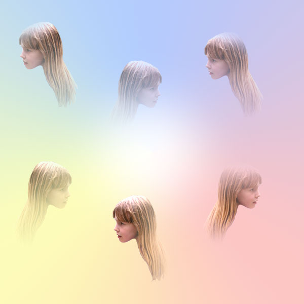
Thought it might be good to catch you in between challenges, in case you have nothing to do!!! Just joking. But I just checked out a private photo gallery after reading a review in a digital photo mag about this 82 year old lady, and want to know how to do something. The URL is kaymontclare.com and there is a shot called "Between heaven and earth" where she has done something neat with the colours all oozing together, can you figure out how it is done and please let me know Oh Goddess??
Thanks for your help,
Glenis the menace
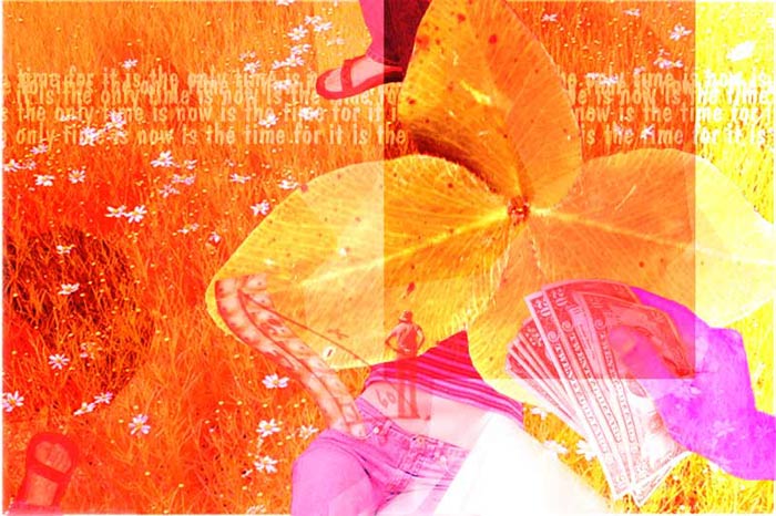
Hi there, Glenis! Yes, it is good that you caught me between Challenges! :) I had a look at Kay's lovely image and then set out to create something using a similar effect. What I came up with is this composite which speaks to the uncertainty of childhood:
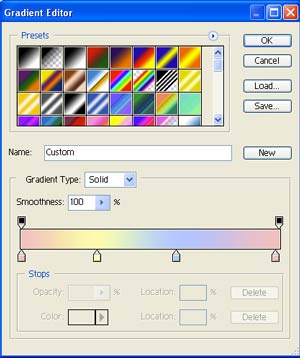
To do this background with the most control, I used an Angle Gradient (in the Gradient Options bar).
1. Click the gradient sample in the options bar and make your own gradient with the colors you want. Here is the one that I came up with for this:
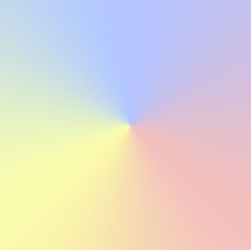
To come up with the color stops, click where you want them on the lower part of the bar, and new color stops will appear there. Click the color swatch to change the color. Make it so that the ending color is the same as the beginning one, as i did here with the pink. Now drag the gradient across the canvas, beginning in the center. Now you end up with this point in the middle:
2. To lose that "point" in the center, Make a new layer and put a giant blob of white paint there and blur it till you can't see its edges, but the center is still hidden.
3. For the faces to be partially hidden in the "clouds," I made a layer mask on the layer with all the faces. Then I made a selection of the first face, and, using a linear black > transparent gradient, I faded in parts of the face. I repeated this with each of the 6 faces. I hope that this helps you out!
Always me, Janee
|
|
|
|
|
Maximizing area, given proportions.
For some of my Art Challenges, I ask that images be a maximum of 300,000 pixels. To figure out how many pixels in an image, multiply the width and length under the image size tab. To keep your proportions of your picture and make your image as close as possible to 300K pixels, you can either guess at values till you come up with something close enough, or you can use this calculator formula at the right. (Don't be intimidated by it. You can follow it if you take your time and go step-by-step.)
Also, for the Challenge, I ask that the maximum size for a side of a thumbnail be 100 pixels. If you put in 100 for your longer dimension in the Image Size tab, there you are!
|
|
Current dimensions are a and b.
/ (desired pixel total) =
This number is the new a dimension. Put this in the "image size" for the a dimension and the new b dimension will be calculated automatically.
For example, if my current image dimensions are 1400 x 1000 and i want my finished image to be 300,000 pixels, then here is what i do:
| Operations |
Calculator keys |
| Multiply 1400 by 1000 |
1400 * 1000 = |
| Divide by 300,000 |
/ 300000 = |
| Take the reciprocal |
1 / x (key) |
| Take the square root |
x ^ y (key) .5 =
(or the square root key) |
| Multiply by 1400 |
* 1400 = |
| Put this result in for your longer dimension. The other dimension will be calculated for you. |
|
|
|
From: Ellen W
Sent: Saturday, February 08, 2003 5:28 PM
To: janee@myjanee.com
Subject: thanks
GREAT IDEAS!!!!! I am a working potter but a newby to digital photography and thanks to you for your site! I just love it. But I have one question. I am using Photoshop Elements 2 and I have been trying to make a brush to create a zigzag edge effect but haven't had much luck. Can you give me some guidance? Thanks!
-Ellen
Hi there, Ellen!
I’m really happy that you are liking my site! Elements is a great program. It has some limitations, of course, but that’s what keeps it easier to use… and $100 instead of $620!
I have a tutorial for making a zigzag stitching effect .. but it won’t work in Elements. The reason is that in Photoshop you have a “direction” option for the brush, which Elements doesn’t have. If you are doing this for just one border.. like you don’t need it for a whole bunch of projects, you can do it by hand. Here’s how I’d go about this, in Elements:
1. Choose a brush in the width you want.. probably a 1-3 pixel wide hard-edged round brush, and the color you want.
2. Make a new layer.
3. Now.. you are going to make a V shape with this brush and then copy it for your horizontal zigzag. Click with your brush at the top of the first zigzag.
4. Hold Shift, and click at the bottom of the V.
5. Hold Shift and click at the other top edge of the V. (Click left top.. Shift-Click at bottom … Shift-Click right top.)
6. Now.. to copy this V across. First duplicate this layer, by dragging it to the Create a New Layer icon at the bottom of the Layers palette.
7. Ctrl-click the V layer. This loads it as a selection. If you select it before you copy it, it will keep all the copies on the same layer, keeping your layers palette neater. ;)
8. Choose the move tool. Hold Alt-Shift, and drag the copy to the right. (Shift constrains the drag to 45° angles.)
9. Continue holding Shift and Alt, releasing the mouse, then clicking/dragging another copy, till you have your nice horizontal line of V’s.
10. For a vertical line of V’s, take this line you just made and duplicate it.
11. With move tool chosen, hold Shift, and rotate the line of V’s till it is vertical. (Shift, when rotating, constrains the rotation to 15° angles!)
12. If you want a curved portion, you can do this, too, but you would probably do this just as well by stroking individual V’s. I’d do this by making a circular selection and then keeping your strokes within it, as I have done in this gif :
Anyway… not particularly easy.. certainly not as elegant as the method in my stitch in time tutorial, but… it will work. Let me know if you get stuck on any part of this.
Always me, Janee
From: Sarah H
Sent: Friday, January 31, 2003 9:22 AM
To: janee@myjanee.com
Subject: can you please help....
Hi, Love the site! I find it very useful when I get stuck in Photoshop. Unfortunately I cannot find my newest problem in your site and wondered if you could help.
I have two separate files in Photoshop and I want to move some layers from one to the other. Is there a way I can move all of them at the same time, rather than having to do it one at a time and then having to repostion them? I tried flattening the layers, but then they are no longer editable.
Hope this makes sense, and i look forward to hearing from you
Warm Regards
Sarah
Hiya, Sarah!
You are gonna love this. You have PS 6 or 7, right? Well then.. you have a cool thing called Layer Sets. Here's how it works:
Link the layers you want to drag to the new file.
Now, in the Layers palette... to the upper right side, is a flyout arrow. Click that and choose New Set from Linked.
Drag away!
Layer sets give you freedom to do all manner of things. You can put a mask on a layer set, transform all the stuff at once (you can by just linking too.).. and move it up or down in the layer stack just with one pull!
So... am I right? Try this and tell me how awesome this is!
--Always me, Janee
Hi Janee,
OMG, you were so right! It is so quick and easy.
Your instructions were great as well. Thanks for your help once again. You have a fabulous site and is a real gem when facing problems in photoshop. It is nice to find someone who is willing to spare a little time to help others.
Once again thanks for your help and time.
Warm Regards,
Sarah
From: L, John
Sent: Tuesday, January 28, 2003 1:36 PM
To: janee@myjanee.com
Cc: apg) j.lo
Subject: ask the goddess
I have few PS books and cannot find in any of them the answer to my question. Maybe i lack the right terminology? Anyway,...
I have a piece i am working on that has many layers. Quite a few are text. There is an image behind them all. I haven't been able to rotate an individual layer by itself. If i go image > rotate > ...everything rotates. Hunting the indexes of the various books i have i can't find 'rotate' where it means anything other than rotating everything.
I've managed to work around this by cutting the layer, pasting to a new file, rotating, and bringing it back. but there must be a better way.
Your site is very cool btw. I'll be coming back.
thanks a lot
j.lo
Hi there, J.lo!
You are gonna love this answer. You don't want to rotate the whole image; you want to just rotate a layer. Rotation is a kind of transformation, so it is transformation you want to do. In the top menu, click on Edit > Transform... and look at all your choices. Rotate is one. You can also rotate to a set amount of degrees in the options bar there.
While you are in the Edit menu.. you also see Free Transform. If you click that, you get the transformation handles and you can rotate or stretch or distort or whatever. Holding ctrl gives you more options. And holding shift constrains your rotation to 15° increments. Very cool stuff. Distortions (holding ctrl with free transform) are cool.. Hope this is helpful to you, John!
Always me, Janee
Sent: Friday, January 17, 2003 8:50 AM
To: janee@myjanee.com
Subject: Ask the Goddess
I've been puzzling over something that I just can't seem to get. Maybe you can help with this. Suppose I have a bunch of pictures that I want to just save them as tifs. I know that I can do this with an action, but for some reason, I can't get it to work. TIA for any help.
--DAD
Hi there, DAD!
Actions can really save a ton of time, especially when you write them to do something like this that is a small job, but common, repetitive and boring.
To do what you are talking about is a two-step process. You first make the action that tells PS what you want done to each of your photos. Then you do a Batch-Process to tell PS WHICH photos you want to have worked on, which action you want used, and where you want the resulting files placed.
In case someone wants to know how to do this from scratch, I'll use this particular action and describe the steps in detail:
Making the Action
- Have a document open on your desktop.
- If you are making a TIF, it will ask you if you want it layered or not, but only IF your example pic has layers. I'll assume that we are starting with pix that might have layers, but we want the finished TIFs to NOT have layers.
- Click the Actions tab to bring up the Actions palette. (or go to Window > Actions.)
- At the bottom of that palette, click the Create a New Action icon. Give your action a descriptive name. I used "Save as TIF."
- Now clear your throat and hit the Record button at the bottom of the Actions palette.
- Go through the motions of saving that file you have open.
- File > Save as... and choose TIF.
- Uncheck Layers and then .. this is important.... DON'T rename the file. Just take the filename that they give you.
- Hit Save. In the next box that comes up, choose whatever options you like there and choose OK. (This box, by the way, gives you another chance to choose to NOT have your TIF be layered.)
- Hit the STOP button on the bottom of the Actions palette.
Doing the Batch command:
- Be sure that all of the files you want to work with are in one folder.
- Make a new folder in which to put the TIFs you are about to create.
- Let's go! File > Automate > Batch.
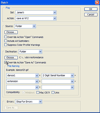
- Choose your "Save as TIF" action.
- In that box, choose the source of the pics you want to work with. In this case, it is the folder where they all are.
Click that dropdown, and you will see that you can also use "opened files" as a source (if you have files open). This can be handy for processing stuff that you are working on. In the Destination, click Choose, and find the folder you made for this purpose.
- Now.. for this action, you want it to Override the Action's Save As commands, so check this box. (If you don't, then your TIFs will be stashed wherever PS deems appropriate, either in the last place you saved something, or in the folder where you happened to put the file you used when creating the action. Not cool.)
- In File Naming, put in a filename and choose how many digits and what kind of serial number you want.
It shows there an example of how you have it set up, so you can see what the filename will look like. Since i have dance1 for my filename base, and a 2-digit serial number, i'll have dance101.tif, dance102.tif, dance103.tif, and so on.
(Personal Note: I use this batch process when i'm doing pictures for books. For these, i have to have a high-res TIF image and then a lower res "placeholder" JPG image, just to put in the body of the manuscript so that the reviewers and editors know what pic is to go there. When i use like dance1.. i put it into a folder dance1. Then when i go to make the jpgs, i can just use that dance1 folder of TIFs to make the JPGs!) Hope this helps, DAD!
Always me, Janee
|
|
|
|

|
|
| How I became the "Graphics Goddess"
|
|
|
I've done a lot of things. It is as if I've been searching for who I really am. I got started in graphics and web design .. this is kind of a funny story in a way, and offers a little peek into the sort of goofy person that I really am. I had a bakery, a little catering operation and I did cakes and cookies and pies and stuff which I delivered locally. Wedding cakes got to be a huge part of my business, and of course they were all on weekends. It occurred to me that I wanted to change things so that I wasn't working every weekend and so I thought of the idea of putting coffee cakes and brownies on the web. I developed and tested some recipes, coming up with a couple of awesome recipes. Then I ship-tested some on some friends of mine around the country and they shipped/lasted well. Cool.
So I needed a website. I, of course, running my biz on a shoestring, didn't want to spend any money. <g> So I asked my nephew who was in computer science in college and he said that he'd do it in his spare time. Well, college kids, as you are well aware now, have NO spare time, so the site didn't get done. I had a domain and everything just sitting there. Then I got really sick and had to close down the biz for 4 months. During that time I didn't do much of anything except try to get better, which I ultimately did! Then I had been reading computer mags and such about how easy it is to build your own site with the software that makes it easy. I went to the CompUSA and the salesman told me not to get just hokey template software (Get your site online in less than an hour!) but instead to go a step above that and get MS FrontPage. Ok, so I did.
My first site was my own personal site. I had 4 links off my homepage: Hobbies, Photos, Links, and Blackberry Hill, which was the name of my business. Eventually I made a page for each of my hobbies, which, in those days, did not even include art! Photos became a photo album. I wrote an article and some other stuff and added a Writings page. And so it went. In those days I was just taking graphics from other sites.
Then one day in the fall of '99, a friend of mine told me that I ought to be doing some editing of my photos because they needed editing. I said that I didn't know how to do that at all and she turned me onto the fact that MS FrontPage had a program bundled with it called Image Composer, a simple photo-editing package. I discovered that I could make myself into twins, that I could give my sister green hair, and that I could take paintings of flowers that I'd taken from other sites and make them into "virtual gardens" which I used, that fall, to decorate my site.
|
|
For Halloween, I was still using borrowed graphics. For Thanksgiving, I borrowed a turkey from a site and tried to animate it using Image Composer. He was supposed to be dancing, but he didn't do very well. <g>
That November, too, my mother fell ill and died in December, so I was afk (away from the keyboard) for much of those two months. In January, I made my own snowflakes with Image Composer and used them to decorate my site. The method that I used is the same one, essentially, that is in my snowflake tutorial now. In fact, I wrote up a tutorial for how to do it in Image Composer. That was my first tutorial.
My husband got me a digital camera, a very nice one, that Christmas of '99 and then in January, he replaced my computer with a fine big new one, the one that I still have. I got MS Photodraw as part of Office 2000 with my new computer and that icon for it with the paintbrush just .. well I had to try drawing. I painted some flowers, I mutated a picture of peas into sand dunes, and the artist was born!
In April of 2000, I was ready for a new image program and I'd heard about Photoshop. One of my friends said that it was the one that the pros used and so I thought that would be something to check out. I was amazed at the $600 tag on it but intrigued too. You know that effect that a very high price has. I read the box and just had to have it. I ordered it from Adobe the next day and got it on the 20th. I hated it at the start. Hard to get used to, things didn't work as I thought, and I was thinking that I'd made a terrible mistake. My friend told me about the newsgroup and so I started lurking there.
As I learn new things in Photoshop, I write tutorials as a way of documenting and remembering my procedures. As with everything else in my life, I put these on the web. These have caught on in a big way with Photoshop learners from all over the world. One of these learners began to address me in email as Graphics Goddess, so the nickname was born!
|
|
|

|
|
|