|
|
|
Gel text! I have been asked by many people to write a tutorial for this effect and here it is at last. This tutorial is written with beginners in mind, but it shouldn't be too boring if you are beyond beginner. As you work through this tutorial you will work with the following:
|
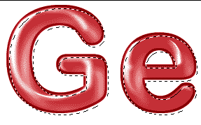
When you look at the "gel" below, what is this? What are we seeing? Let's really LOOK at this:
As we work through this, you can see how you did with these questions.
|
 |
|
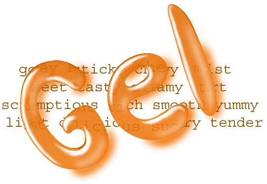
First off.. someone says they want "gel text." How do I come up with it? Ideally, I'd have something like this to look at, whether a gel text effect that I found somewhere, or even a word written in Close Up toothpaste! Then I study this, looking at the highlights and shadows. I ask myself, "What about this makes me think that I'm looking at gel? What are the characteristics of gel that make it unique? What is the difference between what I see in gel and, say, a glob of just ordinary paint?" This gel is red. My carpet is red. How does my eye tell the difference between gel and carpet? For my "model" for this, I looked at this piece that I did sometime back. I used my result from my Capsule Tutorial. And I also just let my vivid imagination carry me. |
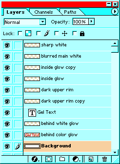
Once I have "seen" what I'm working toward, either in reality or in my mind, I set about solving the problem of creating it. Looking at this result above, How many layers will I need to do this? The answers to the earlier questions will enable me to eventually come up with a result, hopefully one that is good. My most important trick though, is perseverance. That old "try, try again" Action. <g> To begin, I'll give you MY answer to the last question, "How many layers do you think that you would need to do this effect, if you use a different layer for each component?" ... I ended up with ten, counting the background. |
|
|
|
|
TEN? What are they?
Why do we use a different layer for each different little thing? (Think about this before you hover over this layers palette for the answer.) |
 |
|
|
|
|
Ok let's get started making these layers. 1. First we'll do the main text layer. a. File -> New. Choose a resolution depending upon how you intend to use this. For web work, 72ppi is fine and will keep your filesize manageable. For print work, use 300. Be sure that the file is in RGB mode. b. Choose a foreground color for your text in your color picker squares. c. Then choose the Type tool in the toolbar (the capital T) In the Type tool Options bar, make sure that you have the "create a text layer" button pushed instead of the "type mask layer" button. I like using a wide rounded font for this effect, but try a different one if you want. Make the type big enough that you can work with it. d. Then type out some text. e. When you click your mouse in the text layer in the layers palette you "commit" the layer, enabling you to work on other things. (More on text) This also automatically names your layer in the layers palette to correspond to what the text says. The capital T in the layers palette tells you that this is still an editable type layer. You can also draw letters of your own. Doing this effect with writing you have done in script with a fat paintbrush can make a cool natural-looking gel effect. f. File -> Save as ... Name your file and put it somewhere where you can find it. Leave it in psd format. |
 |
|
2. Next we will do the ""blurred main white highlight"" layer. a. Click the Create a New Layer button at the bottom of the Layers Palette (the one next to the trash can) . Name it ""blurred main white highlight." (In version 7, double-click it in the Layers palette to rename. In version 6, click the layer in the layers palette and choose Layer Options. Type in the name of your layer there. and then click OK.) b. Ctrl-click on the Text layer to load it as a selection. |
 |
|
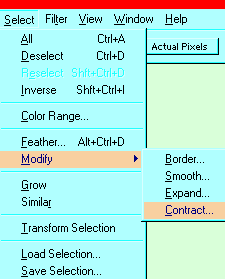
c. Now, in your main menu at the top, click Select -> Modify -> Contract ... The amount that you contract the selection will depend upon how big your text is. Start out with 4 and then if you need to make it more, you can repeat the process. Make it so you have about the same amount selected proportionately as I do here.
|
 |
|
d. Click the blurred main highlight layer in the layers palette. Make white your foreground color. Now alt-backspace to fill the selection with white. Ctrl-d to deselect. e. Ctrl-s to save. |
|
|
f. Filter -> Blur -> Gaussian Blur and give it a bit of a blur. I used 2.9 pixels.
|
 |
|
g. Choose the move tool Ctrl-s to save. |
 |
|
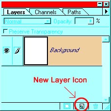
You will be pleased to know that the work that you just did in making that highlight will serve you for 3 more of your layers. 3. We will do the inner glow next. a. In the layers palette, drag the blurred main white layer you just made to the New Layer icon to duplicate it. Name your layer as you did in 2a above. I named mine "inside glow." |
 |
|
b. Drag this layer to the lower right of your letters. In order to make it "glow," reduce the opacity of this layer. Do this near the top of the Layers palette.
|
 |
|
4. Now to do that sharp white highlight. This, in my opinion, is what gives this its "wet" appearance. a. Choose Select -> Reselect to reselect your last selection. Make a new layer by clicking the New Layer icon at the bottom of the layers palette. b. Be sure that white is your foreground color and then alt-backspace to fill this selection with white. Ctrl-d to deselect. c. Choose your move tool and scoot this to the upper left, probably just to the top of your main white highlight. This adds crispness to the highlight.... way too much crispness, though! Yikes! You have suddenly made this thing look pretty fake. Let's fix it and here is where the artist in you can take over. |
 (In the e here, the selection is too small as you see, and so I did the horizontals by hand with a hard-edged brush, then erased the excess with the larger soft brush as I describe in the next step.) |
|
(Note: in the following two diagrams, I have turned off the eye in the inner glow and blurred white layers so that you can better see what i'm doing with this highlight.) d. Choose your eraser tool and a soft brush tip that is bigger around than the biggest part of this highlight you just made. In the Brush options, (under Brush tip in v. 7) make sure that the spacing is set to 1. e. With broad strokes and no hesitancy, erase most of your crisp white highlights, leaving just the part in the upper left edges of your text. For straight pieces, click your eraser at the beginning of the stroke, hold shift, and then click the end of the stroke. (This works for painting, airbrushing and smudging as well!) I've shown at the left what the sharp highlights layer looks like alone with the text. While you are keen with your eraser, you may want to touch up the blurred main white and inner glow layers as well. I did some touching up on the e, for example. Ctrl-s to save. If the artist in you has gone on break or never did show up, don't despair. You CAN do this! |
 |
|
5. We are not quite done with the sharp highlights. I'd like to have some sharp white highlights at the ends. Do these by hand as follows: a. Make a new layer. Choose your paintbrush and a brush that is hard and is a bit smaller than the stroke of your text. Make white your foreground color. b. Make dots there at the ends where you want the light shining. For mine, the light is shining from the top left, so any ends that point toward the top or the left got this treatment. c. Choose a soft eraser that is a little smaller than the dots. Erase in so that you have highlighty-looking crescents at each of the ends that point toward the left or top. Zooming in can help a lot. |
 |
|
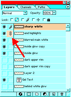
d. Once you have the ends looking good, click on the "sharp highlights" layer, then on the little square next to the eye on the "end highlights" layer. This links these two layers. e. Layer -> Merge Linked. Ctrl-s to save. We have just 3 things left to do: the dark upper rim, the colored shadow, and the white underglow. 6. We will do the dark upper rim first. This is basically a stroke of the outer boundary of the text with the inside blurred a bit.
|
 |
|
What we will do is to make a selection of the text and then stroke that selection with a darker shade of our color. Then we will blur it to blend in and, finally, trim the excess, so that all we have is a thin rim. Let's do it! a. Make a new layer and label it "dark upper rim." Load the text layer as a selection. If you forget how to load the text layer as a selection, think a moment.. then refer to step 2b if you need to refresh your memory. b. Choose a darker shade of your main color in the color picker, and then Edit -> Stroke. I made mine 3 pixels. We don't really want this dark rim around the whole letter, though, just around the top. c. Choose one of your SELECTION tools and then put your cursor into the selection. Then you can drag the selection down and right a bit, as I have to the right. d. Hit the delete key then to wipe out all the pixels on that rim layer that are in that selection. Ctrl-d to deselect. |
 |
|
We want this rim to blend into the gel now, not to be so crisply distinct from it. Here is one way to accomplish this. We will blur the whole rim and then trim the outside so that it is in crisp alignment with the text layer. e. Using the magnifier, zoom in a bit as I've done below. With the "dark upper rim" layer clicked in the layers palette, Filter -> Blur -> Gaussian blur. Look at the lower edge where it meets the letter. You want this to be a smooth and natural looking blend here. Pay no attention to that ugly blurring outside the letter. We will take care of that soon. :) I used a blur of 2.9 for mine. The amount of blur you use will depend upon the size of your letters and the resolution in which you are working. f. Reload the text as a selection and then Select -> Inverse .. and hit the delete key. This trims the excess fuzz off the dark upper rim. Neat and pretty! |
g. Now with the selection still running, click on each of the white highlight layers and hit delete too. This will trim any lingering fuzz from these. h. If you want to add intensity to the dark rim, you can drag this layer to the new layer icon to duplicate it. Ctrl-s to save. |
 |
|
|
7. Depending on your use for this text, you may want to have a colored drop shadow as I do, to lend it that really 3D look. Here's how to get it. a. Drag the text layer to the new layer icon to duplicate it. In the Layers palette, drag this colored shadow layer below the main text layer. Label this layer "behind color glow." b. Using the move tool, drag this layer to the lower right of the text. c. Filter -> Blur -> Gaussian Blur .... It will ask you if you want to rasterize the text (make it into uneditable pixel format); say OK. Then give it a blur which gives an effect you like. |
 |
|
Ctrl-s to save. 8. You do the white underglow much the same way as you do the white blurred highlight in the beginning except that you don't contract the selection. a. Ctrl-click the text layer to load it as a selection. b. Choose white for your foreground color. c. Make a new layer and drag it in the layers palette to between the text layer and the "behind color glow." d. Alt-backspace to fill the selection with white. e. Filter -> Blur -> Gaussian blur.. and give it an appropriate blur. Ctrl-d to deselect. Ctrl-s to save. |
 |
|
I hope you enjoyed this tutorial and that you learned some things about layers, highlights and shadows that you can use in other projects too!
|
|
All material in this site is ©2001-2008 by myJanee.com Graphic Creations. No part of it may be used without my written permission. If you have questions or comments about this site or its construction, contact Janee at myJanee.com Graphic Creations by email. |
|

