Linked Letters Linked Letters
This monogram style is one that I am fond of for wedding monograms, with the big letter in the middle the last initial and the smaller letters being his and her first names.
Although this is not a "beginner" level tutorial, per se, and not "easy", you can still do it even if you are a beginner! Just take your time with it and be patient with yourself as you work through the steps. If you run across something that you have never done before, just read the directions very carefully and study the diagrams. Just remember that if it were *easy*, everyone would be doing it. Relax, and enjoy this project.
As you work through this project you will work with several techniques:
- Make a 3D-looking letter using a textured alpha channel and lighting effects.
- Use Layers to manipulate parts of an image.
- Use Alpha Channel selections to trim up your work.
- Make a layer effects layer into its own layer to manipulate it.
|


This tutorial was written mostly with screenshots from version 5.5. The screens may look a bit different in newer versions. Where there are significant differences in methods between the versions, I will give the version 5-6 directions in plum.
|
1. Making your center letter.
NOTE: For clarity, I will refer to the outside letters as J, and E, and the inner letter as A. Of course this will work for any letters you choose. <g>
a. Get started:
- File -> New.
- Make your canvas 1000x1000 pixels and, for the web, 72 ppi. If you are planning to print it, use 300 ppi. Be sure you are in RGB mode.
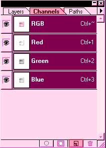
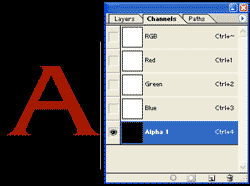
- Click the Channels tab to open the Channels palette.
- Click the Create a New Channel icon (the one beside the trash can).
- Double click the new Alpha 1 channel in the palette and name this channel "ORIGINAL." (In version 5, check to be sure that "Masked areas" is checked.)
- Type the letter d to make your colors the Default colors. In the Channels palette, that is white on black. (Default in the layers palette is black on white!)
|
 |
|
b. Make your Original letter in the Alpha channel:
- Choose the Type tool.
- Choose a font and a size. This will be your center letter. Since you are going to loop your outer letters around it, use a letter with a broad base, not a narrow letter.
- Type a large letter on the black background. Eeek! It turns red! Don't panic.
- Click on the channel name in the Channels palette and it turns the letter to white and has selection ants going.
- Ctrl-d to deselect.
(For Version 6, you need to make sure that you have the "create a text layer" button pushed in the options bar. This is right next to the "create a mask or selection" button. In version 5, the letter will be white as soon as you type it. It will not be selected, either.)
|
|
|
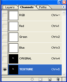
c. Now to make the Texture Channel:
- Duplicate the "Original" channel by dragging this channel to the new channel icon.
- Name the duplicate channel "TEXTURE."
|
 |
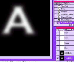
- Click the TEXTURE channel in the channels palette to select it. (You are selecting the channel, not the letter. There should be no marching ants now. If there are, Ctrl-D.)
- Click Filter -> Blur -> Gaussian Blur and choose a setting that gives you a pretty good blur but leaves the letter clearly legible. Click OK.
File -> Save As and pick a name for your file. Leave the format as .psd.
|
 |
- To trim the blurred letter, Ctrl-click "ORIGINAL" in the Channels palette. The blurred letter now has marching ants running around in it.
- Choose Select -> Inverse -> and hit the Delete key.
- Ctrl-D to deselect.
d. Time for some color!
- Click your Layers palette and make a new layer by clicking the Create a New Layer icon at the bottom of the Layers palette.
- Click on this layer in the Layers palette to select it.
- Choose the color that you want for your letter using the Foreground Color Picker.
- Alt-backspace to fill the layer with your color. You just have a layer filled with a solid color now. No letter is visible.
- Ctrl-S to save.
|
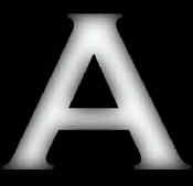 |
e. Ok, now here comes the cool part, bringing the letter up through the texture channel! Here's how:
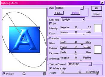
- Filter -> Render -> Lighting effects.
- In the dialog box that comes up, be sure to choose TEXTURE from the "texture"dropdown box. If you don't, your letter will end up just flat.
- Shine your spotlight around till you like the effect that you get. Experiment with different settings. Click OK when you find an effect that suits you. (See below.)
- Ctrl-s to save.
Note: If all is dark at this point and you don't see your letter at all, make sure that
your light is turned on (seriously <g> there is a checkbox for that!) and that your
settings are something on the order of mine. After you get something there, you can
horse around with them.
|
|
h. Trim your letter:
- In the Channels Palette, Ctrl-click on ORIGINAL. The letter that you just made has ants marching around its perimeter.
- Select -> Inverse -> and hit the Delete key to trim your letter.
- Ctrl-d to deselect.
- File -> Save.
|
jj |
2. To make the other two letters, use a somewhat loopy font. I used French Script. For this gold, fill the layer with #BEAD90. (Type this number in in the # box at the bottom of the color picker dialog box.) For a nice more brassy gold, try #CF9F5F.
- Following the directions in step 1, make your outer two letters.
- Do them each SEPARATELY, each on its own alpha channels, and each on its own layer. AND... this is important... be sure that when you do the Lighting Effects, that you use the Texture channel for each new letter, in turn.
- Do not get rid of any of the alpha channels. When you get through with this, you will have 4 layers -- background, BIG letter, and two loopy letters -- and 6 alpha channels, 2 for each letter.
- Label all of your letter layers by double-clicking on the layer in the layers palette and typing in the name. I gave mine the clever names of J, A, and E.
(Labeling layers is a good habit to develop. It may seem stupid with something like this. You have 3 working layers; why do you need to label them? ... Well you are about to have 9 layers very soon and they will look very much alike in the little thumbnail on the layers palette. Trust me. Label them. <stern look>)
|
 |
| 3. Making and arranging the shadows.
Before linking the letters, we must make the shadows and duplicate the shadows. After we link the letters, we will fix the shadows so that they are shading the right things.
a. Make the shadows.
- On each of the letters, click the little f at the bottom of the Layers palette to bring up the layer effects box.
(In Version 5, you can do this: Layer -> Layer effects -> Drop Shadow.)
- Choose Drop Shadow and come up with settings that you like.
|
|
b. Next we will duplicate and arrange the shadows for each of the letters. Here's how:
- Click on Layer -> Layer Style -> Create Layer.
(In version 5.5, you opposite click the little f for the effects on that layer in the layers palette. That will bring up a menu of effects. On that menu you will see "Create Layer". Click on that. This makes your shadow into its own layer!)
- Now duplicate this shadow layer by dragging it to the new layer icon.
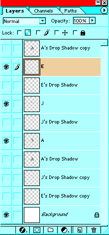
- In your layers palette, arrange your layers as I have to the right. Notice that there is a shadow for J and E above the A and a shadow for the E above the J. There is a shadow for the A above the E and J and shadows for both E and J under the A. That is because of where the shadows will need to be in the end.
- Turn off the "eyes" on all of the shadow layers for now.
- Ctrl-s to save.
|
 |
| 3. Linking the letters. First we will do some preliminary arranging. Then we will plan where we want the loops to go under the main letter. Finally, we will do the linking.
a. Arranging:
- In the layers palette, have your A (center letter) below the other letter layers, so that these directions will make sense. ;)
- By clicking on the different layers and using the move tool, arrange the letters where you want them to end up. (You still want to be able to move them around so don't flatten anything.)
- Drag each of the three letter layers to the new layer icon to duplicate them.
- Click on the eyes for these "copy" layers so you don't see them at this point. (These are little backup copies of the letters. You may not even need the copies, but if you mess up something later, it will be handy to have them.)
b. Planning: Decide where you want the outer letters to loop UNDER the A. Wherever an outside letter goes UNDER the A, you will erase that part of the outer letter.
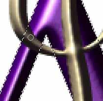
c. Linking:
- Zoom in on an area.
- Ctrl-click on the A layer in the Layers palette to load the A outline as a selection.
- Then click on the J layer in the layers palette.
- Choose a hard eraser with no brush dynamics.
- Erase away the part of the J that is to go UNDER the A. Since you are only permitting J pixels within the selected area to be erased, you are not in danger of messing up the rest of the J. And since you are just working on the layer of the J, there is no danger of your spoiling the A. Aren't layers wonderful?
- File -> Save.
|
 |
- Similarly, with the A still loaded as a selection, click on the E layer and erase the parts of the E that are going to go UNDER the A.
- Ctrl-s to save.
|
 |
|
4. Ok.... now it is looking pretty cool already, but we need more realism here. Let's do shadows! Shadows are the most important part of making this realistic.
When you do get the letters linked, you will see that there are places on the J and E that will need to be shaded by the A. Similarly, there are places on the A that need to be shaded by the J and E. In this next part, you have to really think about what you are doing in order to make this realistic.
a. J's shadow on A: Now we will erase the parts of the J shadow that we do not want. You'll know which parts because it will show up as J shadow on the A where the J is now BEHIND the A. It is a shadow where a shadow should not be:
- Turn on the eye for the top shadow for the J. This will be the one that shades the A. Look carefully at this and determine where the shadow should NOT be.
- Ctrl-click the A's (middle letter's) layer in your layers palette to load the A outline as a selection.
- Then click on the J shadow layer.
- Use your eraser to erase what you don't want as I have depicted at the left.
- Ctrl-s to Save.
b. Now we will do the same thing for the wayward E shadows on A.
- Click on the top E shadow layer in the Layers Palette.
- Load your A layer as a selection.
- Erase the unwanted parts of the E drop shadow.
- Ctrl-s to save.
|
 |
|
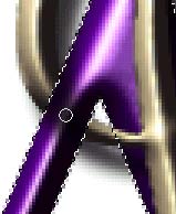
d. Almost there! We still have to deal with A's shadow.
- Turn on the eye for the TOP A shadow.
By moving this shadow to above the A in the layers palette, we have made it COVER the A. Not good.. EXCEPT that we need some of the A shadow to be on the parts of the J and E where THEY are above the A. Optical illusion time!
- Load the A layer as a selection.
- With the top A shadow selected, hit the Delete key. That clears out all the pixels from that shadow layer that were atop the A itself.
Now you want to also erase from the top A shadow the parts that are on top of the J or the E where that letter is on TOP of the A. (If you think about this, it really isn't as hard as I make it sound!)
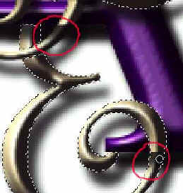
The picture at the right will make this clearer. The red circles are around parts of the top A shadow which are covering parts of the E and J that ought not be in A's shadow!
- Ctrl-click the E and, with the top A shadow selected in the layers palette, erase away the unwanted parts of the shadow.
|
[Note: Another thing that you may have to consider is this: Should the shadow for the E's top tail be farther from the E where it shades the background than it is where it shades the A? Yes! Because of the darkness of the A and the small size of this image, that doesn't matter much here, but you should consider this in your work.
If you need to make part of a shadow closer to the letter or further away, you can select that part of the shadow. Then Ctrl-Shift-J to put that part on its own layer. Then use the move tool to scoot it into position.]
|
|
Give yourself a cool background if you want. Then save your .psd file. and then, instead of flattening it, use File -> Save a Copy (in v. 5), File -> Save as.. or File -> Save for Web to make your .jpg or .gif. (More on saving files)
|
|
|
|
|
RETURN to Janee's Archive Tutorial Index
Ask tutorial questions in the Message Board or email me!

|
|
|
| All material in this site is ©2001-2003 by myJanee.com Graphic Creations. No part of it may be used without my written permission. If you have questions or comments about this site or its construction, contact Janee at myJanee.com Graphic Creations by email. |
|