Oil Painting
from a Photo
Oil Painting
from a Photo
It seems like we Photoshoppers are always trying to make our paintings look like photos and our photos look like paintings. In an effort to satisfy the latter urge, I present here a method to make a somewhat convincing oil painted look from a photograph. This is a tutorial that was written for version 6. If you use an earlier version, you can play along for much of it, but for the liquify command you will just have to watch.
As you work through this tutorial you
will do some things that you may have not done before. We will work with
these:
- Multiple Layers.
- Crystallize filter.
- Crosshatch filter.
- Liquify command.
- Layer masks.
- Smudge tool.
However, this is NOT all filters. You will be doing a bit of handwork in this tutorial too. (If you are new to painting, don't say you can't do it! You CAN! And you WILL! And the chances are, you will do at least as well as I did.
The computer can give you courage because if you mess up, you have wasted nothing. No one does anything perfectly the first time they try something new anyway, so jump in with both feet!)
This
is a process that takes some time -- it took me about an hour to do it
-- but in the end you will have a real-looking oil-painting effect that
I think you will like. This tutorial is best suited for people who are
patient enough to work hard for good results. The Photoshop tools and
techniques are not too difficult for a rank beginner and the tutorial is
written in a way that a beginner should be able to follow. I guess the
big pre-requisites for this tutorial are the three P's: patience,
persistence, and ... Photoshop. (See Note at bottom for a word
about tools.)
|

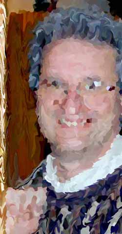
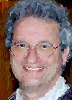
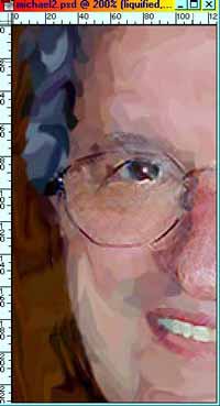
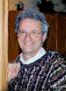
If you are going to use this
photo, use the bigger version by clicking this one and then
opposite-clicking the bigger one that comes up. Click Save As and choose a
name for it. I suggest "Michael". :P
Choose a photo of something
important to you, or one you really like. I will choose one of the more difficult subjects,
one of the least forgiving for me, because I tend to like him just as he
is, my own husband. :) You may use this photo if you want to for the purposes of this
exercise only. To do this, click this smaller version to the
right and it will take you to a larger one. Opposite click that and
choose Save As... I urge you, however, to use a subject that
is important to YOU. This is an exercise that you will be taking some time
with, to do it right, so you may as well be doing it on something that you
care about.
|
|
|
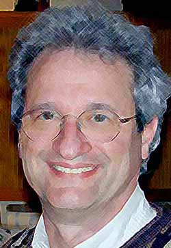
1. File -> Open .. and open the
file with the photo. Drag your photo layer to the new layer icon in the
layers palette to duplicate it. We will be working on the top one of
these, so be sure that it is selected in the layers palette. (Can you
think of two reasons why you would want to duplicate this layer?)
Label your first layer "Original" and your
second one "Fixed". Click the little arrow in the circle on the
layers palette, click layer properties, and then type the name there.
|
| 2. Before we do anything else, let's clean up the
photo. There is an expression "Garbage in; garbage out." This
means, in this case, that if we start out with a flawed picture, we are
going to end up with a flawed painting! Using your "Fixed"
layer, take your rubberstamp tool and get rid of that glare on his
glasses. Use a fine paintbrush to touch up his eyes where the glare was.
Paint the glare off his glasses. This would also be a good time to
get rid of distractions in your background if you want to. This would have
been a good thing for me to do with this picture, I suspect.
(Hint: A neat way to do this sort of hand touchup
painting is to choose a small brush and then hold the alt key as you hold
your brush over a part on the picture that has the color you want. That is
like dipping your brush in that paint! Then release alt and paint your
target area. It works like the rubberstamp.)
Ctrl-s to save.
|

|
|

|
There are, of course,
many styles of oil paintings, probably as many styles as there are
artists, but I'm going to go through how I'd want to see this painted.
If you have other ideas, then think of how you would incorporate them.
3. Duplicate your "Fixed" layer and name
the copy "Liquify". To that "Liquify" layer, first
apply Filter -> Pixelate -> Crystallize. You
don't want HUGE crystals here, but you want maybe size 6 or 12. I used
12 here.
Ctrl-s to save.
|
| 4. Image -> Liquify. This
brings up the Liquify box with your picture in it. To the left in this
window, you will
see the liquify tools and there are settings to the right. Choose the
brush tool and a diameter for your brush that seems appropriate for the
area in which you are working. For his hair, I used a smaller brush and
swirling motions with my pen. (I use a Wacom Intuos tablet.) I used a
bigger brush for the background and for his sweater. Don't worry about
the edges.. we will neaten those up in a minute. Don't mess
with the facial features, either. We will do those next.
You will find that the Liquify command is much
like finger painting. You dip your brush into the paint that is in one
of the crystals you made and then you drag it across your painting. If
you really mess up while you are in this box, you can click
"Revert" and it snaps you back to your original state. To
make your brush bigger or smaller easily, click the [ or the ] keys.
Whether you use big strokes or small will depend
upon your own style and how you want your result to look. Once you
are satisfied that you have most of this done to your satisfaction,
click OK. It will likely take a little time for PS to do its work here,
at least it does on my computer. Go answer an email and then come back.
(Didn't the Wizard of Oz say something like that?.. No.. that was
"Go away and come back tomorrow!")
Ctrl-s to save.
|
|
|
|
5. In the next step, we are
going to put a mask on the liquified layer and then cut holes in the
mask over his facial features so that the layer underneath will show
through. This will let his facial features be sharp. First though, let's
apply some brushstrokes to the underneath layer so that it looks like
these features have been painted. Duplicate your
"Original" layer again so that you now have 3 layers. Label
your new one "Crosshatch" and drag it to the center of the
three. To this layer, apply Filter -> Brushstrokes -> Crosshatch.
I used settings of 9, 9, and 1. (If you want to try another stroke
besides crosshatch, feel free. There are many many different ways you
can do this to get a cool effect.)
Notice
now that we have lost some really important detail from his face,
notably the sparkle in his eyes. We will bring that back in a bit. :)
Ctrl-s to save.
|
|
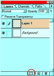
6. With your "Liquify"
layer selected in the layers palette, click the Add Layer Mask button at
the bottom of the palette (See right). Notice the little white mask that
appeared beside your thumbnail of your "Liquify" layer? The
white parts of your mask are the parts that you cannot see through to
the layer below. Black parts are transparent to the layer below. What
would gray on the layer mask do? (Try it!)
(If this is the first time you have
dealt with a layer mask, take the opportunity to mess around with it a
bit now. Grab your paintbrush and paint around on this mask with black.
Choose your linear gradient tool and drag a gradient across the mask.
I'm sure you are thinking of things that you could do with this valuable
tool! Before you go back to the directions, fill your mask back up with
white. ;))
|
|
|
|
7. Ok now click the mask in the
layers palette to be sure you are working on it. Then, using a fine
soft brush, draw in black on the mask around Michael's glasses,
eyes, his mouth edges, and his nose contour lines. If you overdo the
black, no worry! just switch to white and paint it white again!
Layer masks are the ultimate tool for clumsy bunglers!
Ctrl-s to save.
|
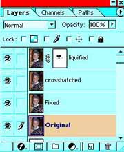
| To take inventory,
you have 4 layers, one with a layer mask. This is what my layers palette
looks like.
So we are kind of working our way inward. The top
layer is the big liquify brush strokes. The next one is the finer more
meticulous crosshatch strokes. Next we need to recover those little
hidden details from UNDER the crosshatched. How are we going to do
that?
|
|
|
|
8. We are going to
make a mask on the crosshatched layer now and cut holes in it -- tiny
holes -- for the details of the eyes to show through! Do this just as
you did for the mask on the liquified layer. (Think about it before you
scroll back up to remind yourself how.) The layer that you are
uncovering a bit, permitting to peek through is actually the unfettered
view, before we did any filtering or anything other than retouching.
9. Once you have your mask, take your black and a
tiny brush and touch it around where you want that glint from his eyes
to show through. You can also brush around a little wherever you want
the crosshatch look softened a bit.
10. There will be places where colors meet which
are still kind of "crystally". You can use the smudge tool on
the "liquify" layer to neaten this up.
11. Once you are pretty sure you are mostly done
with the masks, that is, you are happy with the important parts of the
picture but just want to touch up edges around his hair or background or
something, you can flatten. BUT before you do, Ctrl-s to save and
then File -> Save as ... and name it Michael2.psd. This way, once you
flatten it, you won't accidentally just ctrl-s out of habit and
accidentally get rid of your layered copy. Do I sound like the voice of
experience here? ;)
|
| 12. Now for the final
touchups on your flattened image. Use your smudge tool and a
small-medium brush to straighten up your edges. like between his shirt
and sweater.
Use the smudge tool to rid your painting of any
unwanted "crystally" look by using little circular motions
through the crystally parts. You will see what I mean once you get into
this. There will be some parts where you can just take your medium
smudge brush and click on an area and just wiggle it a little and that
will give you a nicer look. Every few minutes, Ctrl-s to save.
Wherever you have a clear demarcation between
areas, like the line between the wall he is leaning against and the
background, you can run a medium smudge brush right along it to give a
neat hand-painted look.
Optional question for ambitious students: For the
final touch on the sweater... yes, I know that it looks like I globbed
on some paint for that texture. <g> What do you think I did?
|
Click to see full-sized.
|
|
Ok.. here is a hint: Lighting effects. But what
did I use for my texture channel?
|
 |
| Answer: What I did
was to duplicate the "blue" channel and then render lighting
effects through on a duplicate layer. I dragged this layer beneath the
flattened layer I had already. Then I made a mask on the flattened work
that I had already and painted "holes" to let parts of the
sweater texture show through. For detailed directions on this
duplication of the channel and stuff, see my Amazing
Gradients tutorial down at the bottom, part B.
Note: I
use a Wacom Intuos tablet (6x8) for my work and I enthusiastically
recommend it. I was beginning to hurt my wrist with my mouse and my
trackball was hard on my joints too, though somewhat better. You can
certainly draw/paint with a mouse or trackball, but if you are looking
for an excuse to get a tablet, look no further. The Graphire is under
$100 US. The Intuos like mine is a bit over $200. You can read all about
these beauties at www.wacom.com.
|
I hope you enjoyed this tutorial!
Always me,

|
|
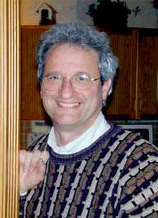
Here is another "painting" that I did using this method. Click it.
|
|
|
RETURN to Janee's ArchiveTutorial Index
email me!
Ask tutorial questions in the myJanee.community:

|
|
|
| All material in this site is ©2001-2003 by myJanee.com Graphic Creations. No part of it may be used without my written permission. If you have questions or comments about this site or its construction, contact Janee at myJanee.com Graphic Creationsby email. |
|
|
|
|