How to use the Dodge tool.
- How to save a file in PSD format.
- How to save a file in JPG format.
- About quality levels in JPG's.
- Keyboard shortcuts
|
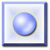
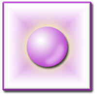
| Pearly Button
Ok, now we are going to fancy things up a bit and you are going to make something that you will think is cool enough to save. This project will combine all of what you did in Basic Shapes 1, and add a couple of other neat little tidbits as well. I will not go into a great deal of detail on the parts that you have already done. I want you to have to think about what you are doing. :P
1. File > New and make your canvas 300x300. 72 dpi is fine, and you should be in RGB mode.
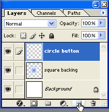
Make a new layer, by clicking the Create a New Layer icon at the bottom of the Layers palette.
Double-click its name in the layers palette and name it "Square".
|
|
|
2. Choose your Rectangular Marquee tool and be sure that your Feather in the Options bar is set to 0. Make a SQUARE selection in the middle of your canvas.
Now before you fling me an email saying that i didn't tell you HOW to make a square, reread the rectangle how-to in Basic Shapes 1, and answer these:
- How is a square similar to a rectangle?
- How is an ellipse similar to a circle?
- How is a square similar to a circle?
- Sample SAT question: Ellipse is to circle as rectangle is to ______.
- How did you get from an ellipse to a circle?
Now do your square. :)
File > Save As .. and think of a name for this. Leave the file type as PSD. Although PSD files tend to be large, this is because they will maintain your layers and keep the quality of your file intact.
|
|
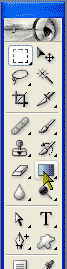
| 3. Now let's fill the square with a gradient! Choose the Gradient tool. |
|
|
Choose your favorite color for your foreground color. I chose a medium blue.
In the Gradient Options bar, be sure that you are using the Foreground to Background gradient, as i have to the right.
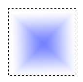
Choose the Diamond Gradient.
|
In earlier versions than 7, your gradient options bar will look a bit different from this options palette of version 7, but it will still work the same way.

|
| 4. Beginning in the center of the square, drag the gradient out to one of the vertices (corners) of the square. If you hold the shift key, what happens? |
|
|
5. Edit > Stroke to outline the selection to make that border around the square. Choose your own pixel width for this. Ctrl-Z to undo if you don't like it, then redo it. When you get the outline as you like it, Ctrl-D to deselect.
Ctrl-S to save.
6. Now for the round button in the middle. We'll make this on a new layer, so click the Create a New Layer button at the bottom of the Layers palette.
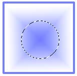
We begin by making a circular selection centered in the middle of the square. Refer to the circle part of my Shapes 1 tutorial if you need help getting started on this.
|
|
| Drag your selection from the CENTER of the square, holding the Shift and Alt keys as you drag. What do these each do? Try it without holding them to see. |
|
|
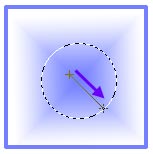
7. From your gradient tool, choose the Radial Gradient Tool. Switch your foreground and background colors by clicking on the arrow above and to the right of the color squares in your toolbox.
8. Drag a gradient from about where i have the red dot in the circle along the red arrow to the far edge of the circle. If you don't get this the first time, just do it again. :) Ctrl-d to deselect.
Ctrl-s to save.
|
|
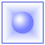
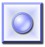
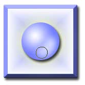
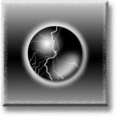
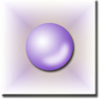
| 9. Now this is pretty cool already, but we have just a few more things to do before it is ready to send to SBS Digital Design. |
|
Look closely at the finished example to the right. What does it have that ours doesn't have? (I identified five things. Hover over it for the answer.) |
|
|
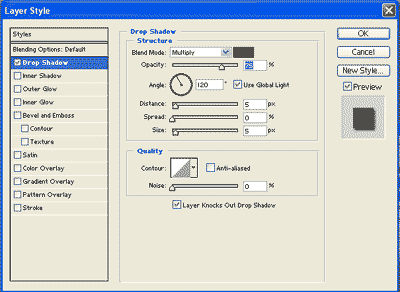
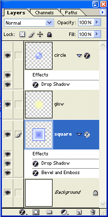
10. See that shadow under the center circle? If you have Photoshop, you do that by clicking on the circle layer in the layers palette and then click the little f button at the bottom of the layers palette to bring up the Layer Style dialog box. Choose Drop Shadow by clicking the words Drop Shadow in the list.
Adjust the options there. My settings are just below.
|
| If you are working in PS Elements 2, click the tab for Layer Styles (go to Window > Layer Styles, if you don't see the tab) and, in the dropdown, choose drop shadow. You can adjust your Layer Style options by double-clicking the little f that appears to the right in your Layers palette. |
|
|
|
|
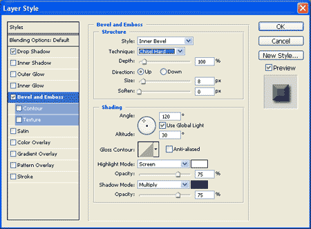
11. The outer part in the finished example has a neat beveled effect. Again, layer effects to the rescue! Click the square layer before adding your layer styles to that layer. My settings for the Bevel appear below. The Size of the bevel will depend upon how large you made your stroke. You can get that nice hard "chiseled" edge by choosing Chiseled Hard for Technique.
(Also, you can play around with some of the other layer effects as well. You cannot hurt anything.)
|
| In Elements, you'll find the Bevel under that dropdown at the top. You don't have as many options for your layer styles as PS folks do, but you have some other neat stuff too. |
|
|
|
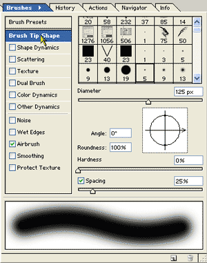
12. Now let's tackle that almost magical glow around the button. We will do that on a separate layer under the button.
Make a new layer, name it "Glow" and drag it beneath the circle layer in the layers palette. Choose a light yellow for your foreground color and the paintbrush tool. In the Brush options (see palette to the right), set up your brush. Begin with a round soft brush. Turn off shape dynamics and check the box to turn ON airbrush.
For Elements, you change your brush options in the Options bar at the top.
|
|
|
13. Using the ] and [ keys, adjust the size of your brush till it is almost the same width as your button. Then hold it in the center of the button and hold it till the ball glows!
Ctrl-S to save.
|
|
| You can also do a glow around the button by using the layer effect "outer glow". Try this and see which you like better! Turn off the "eye" for the glow layer to see what it looks like without that. |
Starting at the bottom, you now have 4 layers:
- Background
- Square
- Glow around the circle button
- Circle button.You actually made these, beginning at the bottom, and building on, except for the glow layer, which you added after you had the button.
|
|
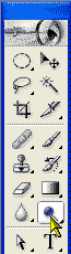
| 13. Now for that final touch.. the glowing white on the bottom part of the round button. Select the circle layer in the layers palette and choose the Dodge tool. It is between the pencil tool and the type tool on the burn tool's flyout. It looks like a black magnifyer. Use a fairly large soft brush, and stroke repeatedly over that area till you have the effect you seek.
Ctrl-S to save your work in PSD form.
|
|
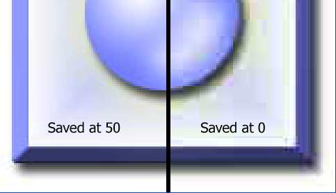
| 14. Now if you want to send this work to your Aunt Bertha, submit it to the Artist-of-the-Week contest, or print it out to frame for your desk, you will want to make a copy of this in JPG format.
(Notice that i said "a copy". Do not get rid of your PSD files as you finish your work. The reason for this is that JPG files will degrade everytime you change something and save it again. Also, saving the PSD file will preserve your layers so that if you want to later change that yellow glow to purple, you can do that too!)
The catch here is that your file size increases dramatically as you go to better qualities. The size of this little file varies from 2K to 8K, 4x the size, depending on where I put the quality setting! You will have to compromise some quality in order to get reasonable load times on the web.
|
|
|
|
|
To save as a jpeg for printing, do this:
File > Save as... and choose .jpg from the format types in the dropdown box. Find a suitable place for it and then click save.
It will ask you for a quality setting. If you have "preview" checked, you can watch your artwork degrade before your very eyes as you slide the slider down toward 0, and then get better as you move up toward 100!
|
For how to Save for Web, see my Save for Web tutorial.)
Congratulations on completing the Basic Shapes Tutorial! I hope you enjoyed it and learned a thing or two too!

|
Student work:
David Park |
Monica |
 Renée
Renée
|
Angela Crawford |
Alexandra |
 Elizabeth
|
|
|
|
|
|
| All material in this site is ©2001-2004 by myJanee.com Graphic Creations. No part of it may be used without my written permission. If you have questions or comments about this site or its construction, contact Janee at myJanee.com Graphic Creations, 7193 W Gifford Rd, Bloomington, Indiana, USA 47403 or by email. |