Just my Type! Just my Type!
So how do we do text in Photoshop? This tutorial will be appropriate for you, no matter which version of Photoshop you have. Some of these screenshots are vintage 2000, but I've left them alone, unless you really need a new screenshot.
See my all NEW Text in Photoshop Tutorial!
This tutorial can be used in a couple of different ways. Since there are so many different aspects of the type tool, if you just want to learn about one of them, you can go directly to that part and just learn about that. Or, if you are one of those sequential learners, (you know, one of you who are actually READING these directions,) you can follow it step-by-step through. Here is what we will go over: 
If you are using Elements 2, you can still do most of this tutorial just fine. Some screenshots will be a bit different, however!
|

- Thumbing through your fonts.
- Changing size of your text.
- Changing the orientation of your text.
- Typing with superscripts, subscripts, strike-through, underline, or small caps.
- Typing in a circle or wave or other warp.
- Typing symbols, «¢£™, for example.
- Creating a text mask or selection and using that to make a "floating text" effect.
|
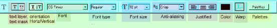
This is the Version 6 Type tool option bar. Click to see larger.
The option bar for newer versions is not much different.

This is version 7's Option Bar. It's nearly identical to PS 2020!
|
| 1. Click the type tool, then your canvas, then type out your text.
2. To move your text after it is committed, choose the move tool and drag the text. (BEFORE you commit, you can move your cursor away from the typing a bit till it turns into your "move" symbol with the arrows. Now you can click and drag to move your text.)
|
 |
|
Next you will commit your text. You don't have to worry about a prenuptial agreement or anything for this "committment". You can always "uncommit" if you want. You can commit the text in several ways. One is just to click the text layer in the layers palette. Another is to click the green check mark in the text options bar. Once the text is committed, you can mess with it.
|
You can always go back and edit the text later unless you have rasterized it, (Layer -> Rasterize -> Type) which changes it from text-as-an-object into pixels. Rasterizing is more of a committment than committing. There are some distortions and filters that you cannot use unless you have first rasterized the layer.]
Once your text is committed, you can do just about anything to it.
|
| 3. Change fonts. Once you have committed your type layer by either clicking the layer in the layers palette or clicking the check mark in the options bar, you will see that the words you have typed appear in abbreviated form on that layer in the layers palette.
Now click the font NAME in the options palette and use your up-down arrows on your keyboard to scroll through your fonts. The font of your typed text should change as you click through the fonts if you do this right. Nifty, yes?
|
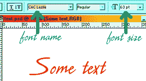 |
| 4. Change font size. Commit your type layer. Click the font size window in the options box. Use the up and down arrows to change the number there. Hit the Enter key and it applies the change to your text. Click the size number again and up/down/enter till you get the size you want. |
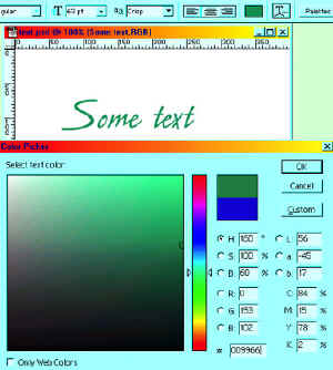
| 5. Change text color. Commit the type layer and then click the "Set text color" box in the options bar. Mine in the diagram to the right is green and at the top of the diagram. When you click that you will get the color picker dialog box and you can pick your color from there, watching your text color change as you move around in the color picker. Neat stuff, eh? |
 |
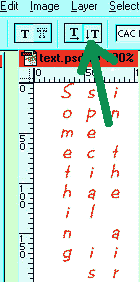
6. Changing the orientation of your text. Ok.. so we have text going horizontally, but what if we want text to go vertically? This is generally pretty hard to read and so would not be practical for long messages, but for a sign or a book title or the like it can be useful! To do this, choose the Vertical Type tool under the Type tool. Type your text. If you want to do multiple lines, you can do that by clicking Enter between the lines. But to do it as i have done to the left, you have to think backwards and type the last line first. The green arrow in the screenshot to the right is pointing at buttons that are no longer there in the newer versions of Photoshop. This functionality is now nested under the Type Tool. |
 |
| 7. To type with superscripts, subscripts, strike-through, underline, or small caps, (in Photoshop) choose the type tool, highlight the part of the text that you want to change, and then click on the Palettes button to the right on the text options bar. Click the arrow toward the top right of that box and choose the format that you want to use.
|
|
|
If you are using Elements, you can still do superscripts and subscripts, but you won't be able to keep your text editable. Here's how:
- Make your text the size you want your main body text to be. Include the sub- or super-script in the line of text.
- Layer > Simplify Layer. This makes your text into pixels, editable as such, but no longer editable with the type tool.
- Use the Rectangular Marquee to select a character you want to be super or sub-script.
- Ctrl-T to bring up the Transformation handles. Hold Shift to keep the proportions right and drag a corner to make it smaller and then use the arrow keys to move it to where you want it.
|
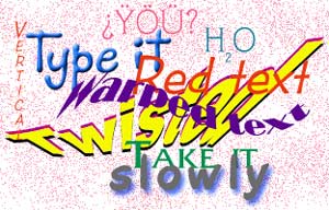
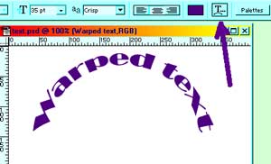
| 8. Warped text.
Once you have your typing done, click on the Warp Text button in the text options bar. You have to play with these options to see what they all do. This one is "Arc" with settings of 93 for bend and 0 for both horizontal and vertical distortion.
|
 |
| This is "Flag" with settings of -79, -57, +13 for bend, horizontal, and vertical distortions, respectively. |
 |
|
Make this third example for yourself. The "gold" around the letters is done using the "stroke" layer effect.
(Layer effects are under the little f in the black circle at the bottom of the layers palette. Layer effects work on type layers just like on other layers. You can even edit the type after you apply a layer effect!)
Try this: Make a line of text, warp it and then use a layer effect on it. Then click your type tool again and highlight the text. You can still change anything, even what the text says!
|
 |
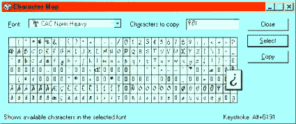
| 9. Ok, so how about those common (and not so common) symbols that you see in people's type? Let's do some of these! If you have a PC, Click Start -> Programs -> Windows Accessories and find your Character Map. This nifty little program tells you what the alt-codes are for all the symbols in all the fonts. Some fonts don't have some of the more esoteric symbols, and some fonts have some really wowza things available to type.

|
To use the Character Map (See below), you choose your font at the top and then click any symbol. At the bottom right corner, you get the alt-code for it. To type one of these, you hold the alt key and type the number on the keypad to the right side of your keyboard. When you release the alt key, your symbol will appear!
If it doesn't work, then either a) you don't have a PC in which case you do something else to get these other characters (I THINK alt-g on a Mac.); b) you are not using the keypad, but the numbers at the top; c) NumLock isn't on. (It is right above the 7 on my keyboard.)
|
|
|
| 10. Creating a Text Mask or selection. First off, ask yourself WHY?
There are many cool things that you can do with text masks. Here is one: Ice Block Text! At this point you are feeling a bit more experienced with the type tool and so I'd like for you to do as much of this as you can without looking at the directions.
a. Make your foreground and background so that they are the default black and white. Make sure that the text orientation is the way you want your text to go, whether horizontal or vertical.
|
 |
| b. You are going to do this effect against some background, so either open a document that has something there, or make a background. I made a sky. This is a great text effect to use for writing on photos, in fact, because you can see through to the photo pretty easily. |
 |
| c. Make a new layer. Click the Text Mask button which is to the left on the Text Option Bar. In version 7, this Type Mask option is in the flyout for the Type Tool in the toolbox. (See right) |
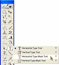
In v. 7, the Type Mask tool is under the Type tool in the toolbox. |
|
You will see the "rubylith" of the mask. Now click on this and type. In order to change fonts or size, you will have to highlight the text by dragging your mouse/pen across the text.
Note: this effect works better with a bigger blocker font than I'm using!
|
 |
| Click the layer in the layers palette to commit your selection. This creates the familiar marching ants that denote a selection. Now you can work with this just as you can with any other selection, except that this is crisp, clear type! |
 |
| d. Read the directions here before you actually start to do it. I want you to do this without looking at the directions.
For this "floating" effect, you are going to do the following:
- Make your text selection and move it to where you want it to be centered eventually.
- Nudge it up and left, fill with white (#1 below).
- Nudge the selection down and right, back to the center.
- Then nudge down and right, fill with black (#2 below),
- Nudge back to the center, then hit the delete key.
|
Look at my picture below and read through the directions again till it makes sense to you what you are doing, then continue.
With your colors default black on white, in order to fill with white, the background color, you hold Ctrl and hit Backspace. To fill with black, the foreground color, you hold Alt, and click Backspace.
To nudge your outline, use the arrow keys. (I like to go from center, up two and over two unless I need more of a contrast, in which case I sometimes use three instead of two. A subtle effect can be very good here.)
|
|
|
| Here is an example of something that I did with this effect.
I hope this tutorial has given you a higher comfort level with the type tool and the text editing of PS. I wish you fun exploring all of its nuances!
Always me,

|
 |