|
Building a Bulletin Board in Photoshop
Part 1: Creating the Corkboard Texture
|
 |
|
|
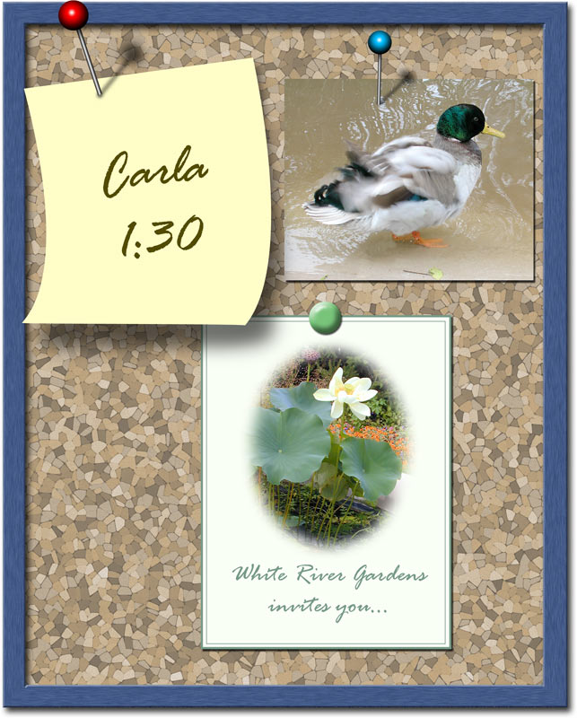
If you have an announcement, make it seem all the more important by posting it to a bulletin board! This tutorial will show you, not only how to make the bulletin board surface and a frame, but how to make pins to attach your memo!
This would be a cool effect for invitations and greeting cards. It also makes a clever website interface.
We'll do this tutorial in parts:
1) Making the corkboard texture
2) Making the frame
3) Making a pin to post a note
| This tutorial will work just fine with either Photoshop or Elements. I wrote it using PS CS, so the screenshots are from that program. If you're using another version, or Elements, your screen will look a bit different from mine, but you'll get the same results. |
|
|
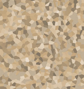
1. Create the Bulletin Board texture
Following this recipe closely will ensure that you get a similar bulletin board effect to this one. Of course, only by deviating from them will you be able to discover new things and possibly an even better bulletin board texture!
Begin with a new file, using the dimensions that you want for your final image. This effect loses impact if resized, so it is best to create it at the finished size.
|
| As you work through this tutorial, you'll learn or practice the following:
Using filters to make a texture.
|
|
|
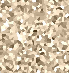
a. Make a new layer, label it “Cork,” and fill it with medium tan. I used #D9C4A7. (Type this into the # blank at the bottom of your Color Picker. This is the Hexadecimal code.)
Filter > Noise > Add Noise. Check the Monochromatic box at the bottom. I used 20%.
Filter > Pixelate > Crystallize. I used a Cell Size of 51, but you may need a different size. This will be the size of your cork pieces, so make it large enough that you can see them at your chosen resolution and image size. |
 |
|
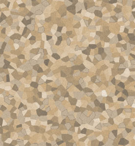
b. The Crystallize filter is good, but it leaves us with too much contrast. In particular, I don’t want the very light and very dark pieces. One way to fix this is to select these places and fill them.
Use the Magic Wand with Contiguous off and a tolerance of about 20%. This enables you to click once for each color. Hold Shift and click a light segment and a dark one.
|
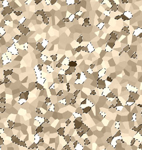 |
| Once you have all the dark and light ones selected, choose a cork-like foreground color (#BCA17A) and Alt-Backspace to fill the selection. Ctrl-D to deselect.
|
|
|
Note: Keeping Track
As you’re exploring and discovering new textures and effects, it is smart to keep track of what you’re doing, in case you want to do it again.
Photoshop has several ways to keep track of your steps, including making an Action, using the Notes tool, or making a Voice Annotation and attaching it to the file. I like to use a more brute-force method, which is also available in Elements:
- Make a new layer for each step, by creating a new blank layer, by duplicating the last one, or by using Ctrl-Alt-Shift-N…E to create a Merged Visibles layer.
- Label each of these new layers with any manipulations you use, including filter settings, colors, etc..
|
|
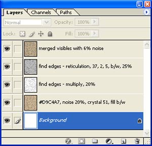
My labeled Layers palette for the finished corkboard
|
|
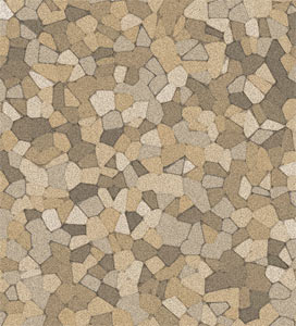
We still need some texture. That will come from the addition of two more layers which we’ll combine with Blending Modes.
c. Duplicate the Cork layer. Name this duplicate layer “Edges.”
For the Edges layer, use Filter > Stylize > Find Edges. This gives you a white background with the edges between the cork defined lightly.
|
|
|
Put the Edges layer into Multiply Blending Mode, and reduce its opacity to about 40%. This gives just a bit more definition to the cork pieces.
d. We still need some lumpiness in the texture. Duplicate the Edges layer, and name the duplicate “Reticulation.” Type D to make your toolbox colors go to the default black/white. The Reticulation filter will use these colors.
Filter > Sketch > Reticulation. The settings I chose are 37, 2, and 5. Put this layer at 25% opacity and Darken Blending Mode.
e. If you want to, you can add a Hue/Saturation Adjustment layer to colorize your cork
f. The corkboard looks good, but almost TOO good.
|
TIP: Making it real
Whenever you are working to create a natural surface, you can usually improve the realism by adding a bit of noise.
|
|
|
| Make a Merged Visibles layer, by using Ctrl-Alt-Shift-N….E. Filter > Noise > Add Noise to this layer. I used 6%. This little noise gives the cork that realistic porous quality.
|
|
| Now let's head over to Part 2, where we'll put a frame on this bulletin board! |
|
|