Cityscape Painting Cityscape Painting
There are many ways to make a photo look like a digital painting, using Photoshop (or Elements) and its native filters. Truth be told, I rarely do this effect the same way, and I certainly encourage you to experiment with different filters, settings, and blending modes here. It is only from experimenting and trying new things, that you will learn the power and versatility of this program!
Though this tutorial is written using Photoshop 7, it will work just fine with PS Elements 2. If you are using Elements, in the last step, you will use an Elemask, instead of the Layer mask.
Although this tutorial may LOOK daunting, because you end up with several layers and a VERY cool result, I wrote this for YOU. I think you will find that each step is well-detailed.
If I had to classify this tutorial to a certain level of user, I would say that this is an intermediate level tutorial. But even if you are an ambitious beginner, you should be able to do this tutorial.
Like this tutorial? Why not have a go at my Photos into Artwork class? This sort of thing is just a part of one week's lesson in that class, as you'll learn MANY techniques to make artwork from your photos!
|
This tutorial makes use of some of Photoshop's cool filter effects. You cannot ruin your picture. When you begin, File > Save as... and name it something new. This is like tucking your original photo back into the album and working with a copy!
So leap right in!
|
|
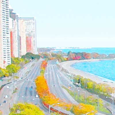
1. Get and prepare your photo.
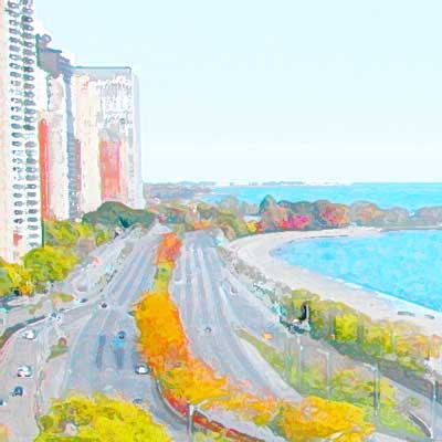
To begin, you need a photo to make into a painting. For mine, I am using the photo which was resulted after my Correcting Uneven Lighting tutorial.
In that tutorial, after I corrected the uneven lighting, using Adjustment Layers, I used another adjustment layer to up the saturation. You may want to increase saturation to bring out some colors in your own photo, too.
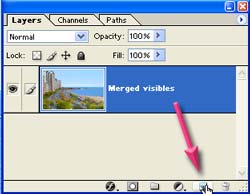
If your photo is in PSD format, and is in layers, you will need to begin this by making a "Merged Visibles" layer.
|
 |
Tip: Making a Merged Visibles Layer
Want to have a "flattened" layer of your image, without actually flattening? Here's how to make a layer that is a snapshot of all you see in your image, without flattening what is there:
- Click on the topmost visible layer in the stack to make it active.
- Click the Create a New Layer icon at the bottom of the Layers palette.
- Ctrl-Alt-Shift-E. Tada!
|
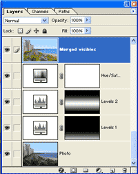 |
| Now that your photo and any of its improvements are made into one layer, File > Save as... and save it as a layered PSD file.
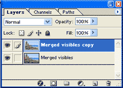
Next, you are going to duplicate this layer and do stuff to it. Then you will blend this layer with the first. You will dupe it again and do stuff to that copy too. Then you will blend all of these together.
Anyway.. so let's go to it:
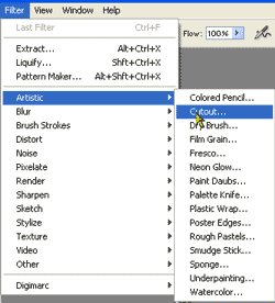
2. Cutout filter layer.
Drag the Merged Visibles layer to the Create a New Layer icon at the bottom of the Layers palette to duplicate it.
|
Aside... Now.. let me state here that this is not necessarily the "best" way to get this effect, and it is certainly not the ONLY way to get a cool painted look. What i want you to do is to have a look at how i do this, and then muck around with this on your own, discovering your own combinations. Some photos lend themselves more to other methods, too, and different kinds of artistic treatments.
|
|
|
 |
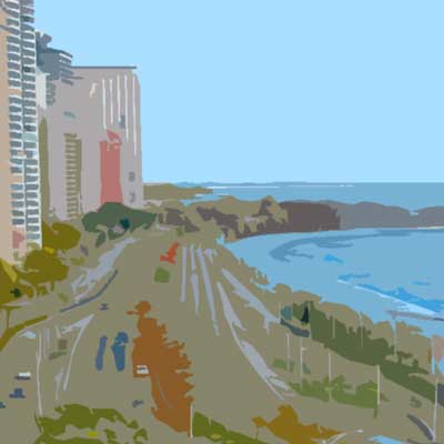
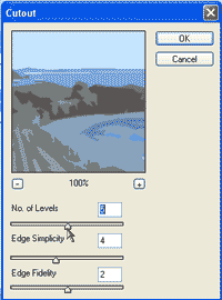
| For this layer, the top copy, I used a filter under the Artistic menu, the Cutout filter. (Filter > Artistic > Cutout.)
|
Here are the settings that I used for this filter. 5, 4, and 2.
|
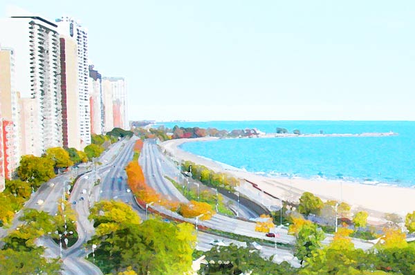
| Here is what the image looks like after I applied the Cutout filter. What this filter does is to reduce the colors and simplify the lines. The degree to which it does this is dependent upon the settings you use in the dialog box.
|
Now, up at the top of the Layers palette, where it says "Normal," that is the Blending Mode. For this cutout filtered layer, change that blending mode to Luminosity.
Ctrl-S to Save.
|
Tip: Remembering what you did.
Do you ever do something really cool and then wonder how in the world you did it? There are some things that you can do to help yourself remember.
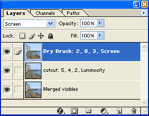
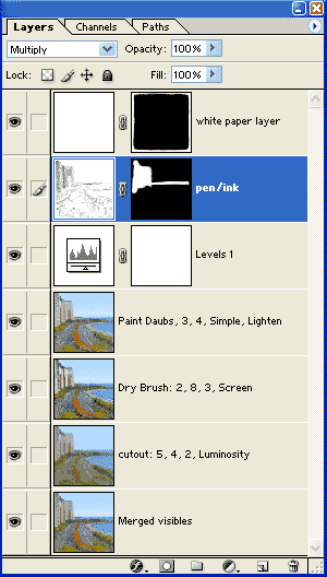
One is to make a new layer for each step, and label the layer with what you did to get it that way. In the Layers palette at the right, i've labeled the cutout filtered layer that way. The 5, 4, 2 are the numerical settings that i used. Luminosity is the blending mode.
|
 |
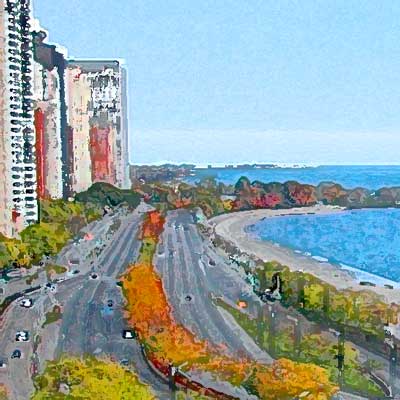
3. Dry Brush Layer.
Next, duplicate the original unfiltered Merged Visibles layer again, and drag this dupe to the top of the stack, as in the layer palette just above. :) To this layer, apply a different filter. I used Filter > Artistic > Dry Brush... with settings of 2, 8, and 3.
|
Then put that layer into Screen mode.
|
|
With each of these layers, you are refining the painted look. You can get all kinds of amazing effects with this sort of manipulation and with different blending modes. DO try the others.
Here is what my Layers palette looks like at this point, with each of the layers labeled. --->
Ctrl-S to Save.
|
 |
|
4. Paint Daubs Layer.
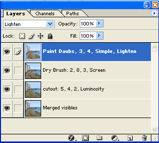
I wanted a little more roughness to the strokes, so i added one more step. I duped the original Merged Visibles layer one more time, and then applied the Filter > Artistic > Paint Daubs, with settings as you see in the Layers palette to the right.
Put this layer into Lighten blending mode.
Ctrl-S to Save.
|
 |
5. Adjusting Tones.
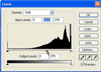
All of this mucking about with filters and Blending Modes, can leave you with tones that are not what you want. I thought that this was a bit milky overall, so i added a Levels Adjustment layer.
Do this by clicking the Create a New Adjustment Layer icon at the bottom of the Layers palette. Choose Levels.. and then adjust the settings.
|
 |
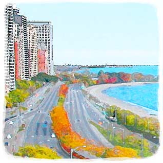
And here is the result!
Ctrl-S to Save.
|
 |
|
|
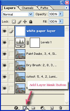
6. Making a Water Color Edge.
But what about this edge? This certainly doesn't look like the edge of a water color painting! How can we get that soft brush-like edge?
I like to finish my edges by using a Layer Mask. (Or an Elemask, if you are using Elements.) Here is an outline of how this works:
- You will put the paper layer on top of the painting.
- Next, you will mask the paper layer, so you don't see it.
- Then you will paint white on the mask, around the edges, so that you see the white paper just around the edges.
Using this Layer Mask method affords you a great deal of flexibility. You can use different textures for your backing, if you want, rather than a solid color. You can even use another photo, or another painting for the backing, as i did at the end of this tutorial, using the line drawing layer.
Here's how to do the Layer Mask edging:
- Create a new layer and drag it to the top of the stack.
- Fill this layer with white, or whatever you want for your background color. (White is probably best for making a convincing water color.) At this point, you won't be able to see the painting. Don't panic. :)
- Click the Add Layer Mask button at the bottom of the Layers palette.
|
 |
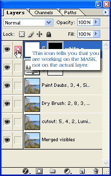
- Click the mask to make it active, choose black for the Foreground color and then Alt-backspace to fill the mask with black.
|
 |
- Type B for the paintBrush, then choose a paintbrush in the Brushes palette. I like just a plain round brush for this, at 100% opacity.
- Choose white for the Foreground color. Paint around the border once, not trying for a perfectly straight border. You want to take off the hard edge here.
|
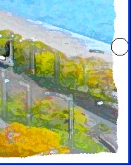 |
- Then reduce the opacity of the brush to 50% and go around again, dipping into the painting a bit, giving that soft water-color edge.
- Ctrl-S to Save. :)
|
 |
|
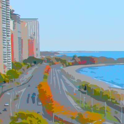
There are many more fun things that you can do with this kind of art.
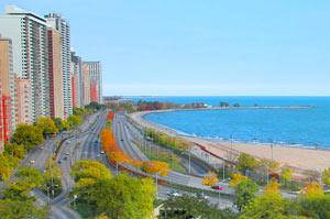
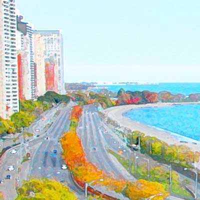
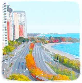
For the painting below, I wanted to make the building lines more pronounced, so here i used a pen/ink effect on them. I used the methods in my Line Drawing tutorial to create a line drawing. Then i blended that layer down using Multiply blending mode. A layer mask on that layer enabled me to paint away the pen/ink for the softer seashore and lakefront. This painting and its methods were the cover story for SBS Digital Design magazine, January 2003.
I hope you enjoyed this tutorial!

|
 |